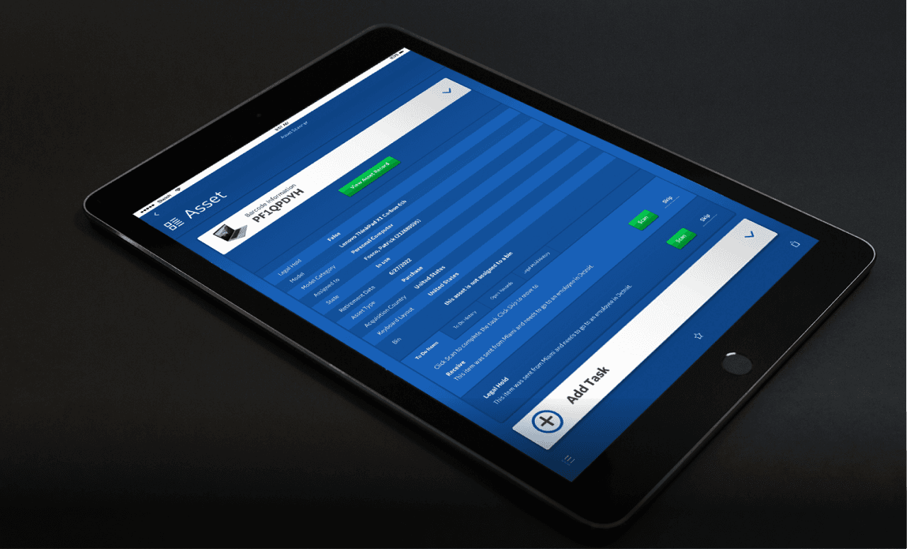
ServiceNow Scanner App
ServiceNow
Scanner App
ServiceNow
Scanner App
General Electric | UI/UX Designer
General Electric | UI/UX Designer
General Electric
UI/UX Designer
Prologue
Prologue
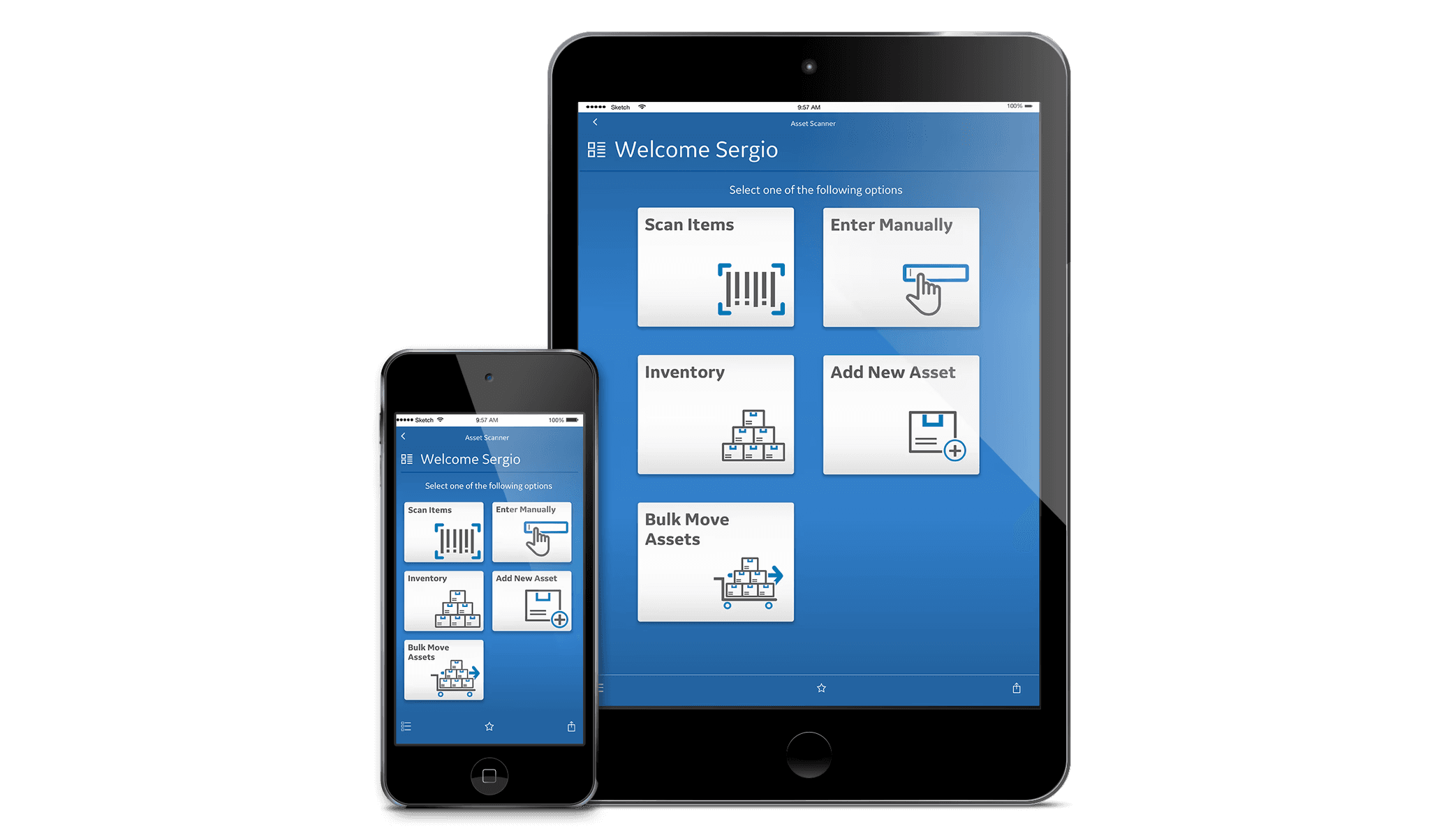
This scanner app is a web-based application built around GEIT ServiceNow’s redesign. This project was born from the company discovering that we didn’t have a good inventory control for our technology/assets in multiple depots across the globe. The data was not accurate in ServiceNow and therefore we were spending money replacing technology that we didn’t lose, it was just misplaced.
ServiceNow offered us a platform in which we could create our own application and pull data directly from it. It was imperative that we found a way to mitigate the problem and keep our technology costs down.
This scanner app is a web-based application built around GEIT ServiceNow’s redesign. This project was born from the company discovering that we didn’t have a good inventory control for our technology/assets in multiple depots across the globe. The data was not accurate in ServiceNow and therefore we were spending money replacing technology that we didn’t lose, it was just misplaced.
ServiceNow offered us a platform in which we could create our own application and pull data directly from it. It was imperative that we found a way to mitigate the problem and keep our technology costs down.
UX Goals
UX Goals
Research how the depots were keeping tabs on the assets and how this application could help them understand their inventory.
Leverage what was out of the box, but improve navigation and ease of use.
Modernize the interface and make it like a seamless extension from GEIT ServiceNow.
The application had to be responsive to work in both mobile and tablets. Not every depot was using the same technology so we needed to make sure it was responsive.
Research how the depots were keeping tabs on the assets and how this application could help them understand their inventory.
Leverage what was out of the box, but improve navigation and ease of use.
Modernize the interface and make it like a seamless extension from GEIT ServiceNow.
The application had to be responsive to work in both mobile and tablets. Not every depot was using the same technology so we needed to make sure it was responsive.
The Journey
The Journey
Before we started building a solution, we needed to find out how this application would be use in a real-world scenario. Some members of our team went to different tech depots around the world to understand how they operated and what the fulfillment workflow looked like from their end.
The research showed us the depots were not in the most optimal shape, they were disorganized and there wasn’t a fast way for them to enter the data into the system. It was a cumbersome task that they were getting behind on (hence why our data was incorrect). During the trip we made a very important discovery which would drive our design decisions. Some European depots were using outdated iPod Touch and iPads to scan the asset’s bar codes. These were not the most optimal devices for the job, but we didn’t have the ability to change that. However, what we could do to help them was to make sure our application could operate properly in them. This event is what gave us the idea to build a responsive application as we didn’t know if other depots were using other devices and what their specifications were.
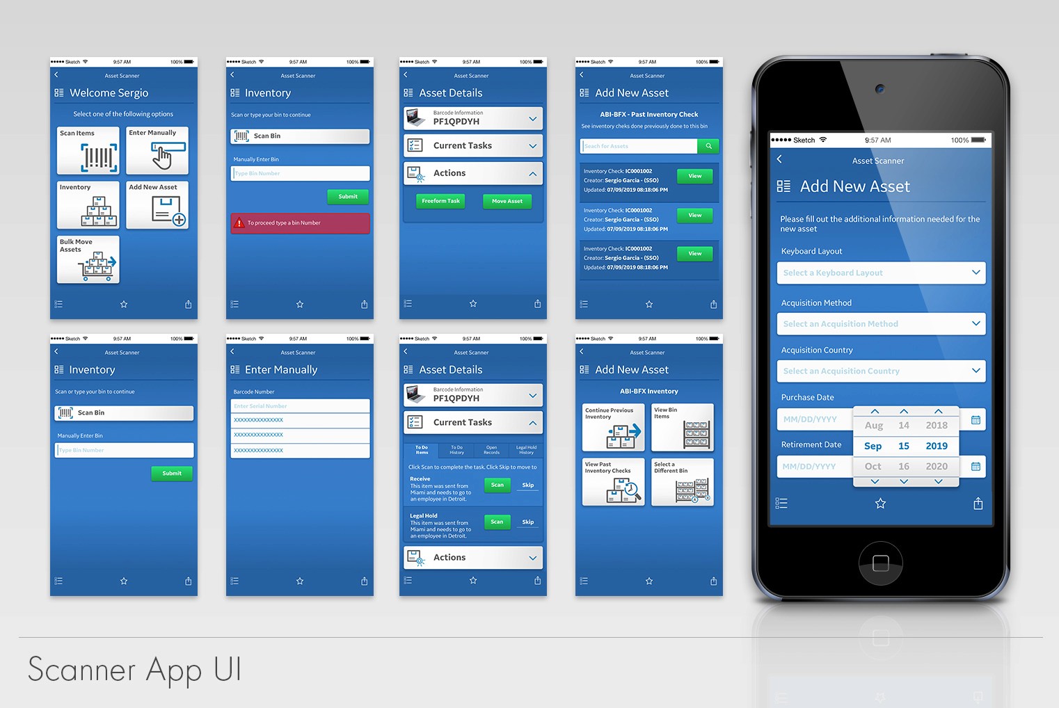
The goal was clear, we had to make it as simple as possible to save them time. We wanted the user to be able to fulfill their task by using their thumb. This would allow them to hold the package with one hand and their scanning device with the other. This logic drove our menu location, font sizes, button sizes, colors etc.
Before we started building a solution, we needed to find out how this application would be use in a real-world scenario. Some members of our team went to different tech depots around the world to understand how they operated and what the fulfillment workflow looked like from their end.
The research showed us the depots were not in the most optimal shape, they were disorganized and there wasn’t a fast way for them to enter the data into the system. It was a cumbersome task that they were getting behind on (hence why our data was incorrect). During the trip we made a very important discovery which would drive our design decisions. Some European depots were using outdated iPod Touch and iPads to scan the asset’s bar codes. These were not the most optimal devices for the job, but we didn’t have the ability to change that. However, what we could do to help them was to make sure our application could operate properly in them. This event is what gave us the idea to build a responsive application as we didn’t know if other depots were using other devices and what their specifications were.
The goal was clear, we had to make it as simple as possible to save them time. We wanted the user to be able to fulfill their task by using their thumb. This would allow them to hold the package with one hand and their scanning device with the other. This logic drove our menu location, font sizes, button sizes, colors etc.
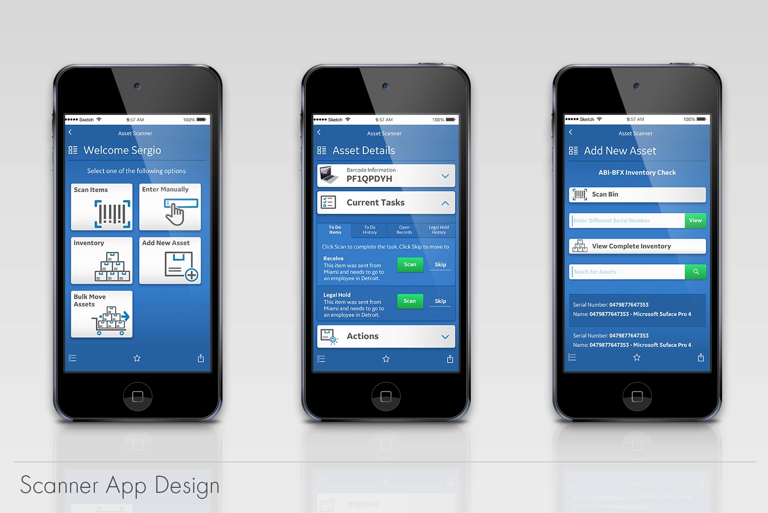
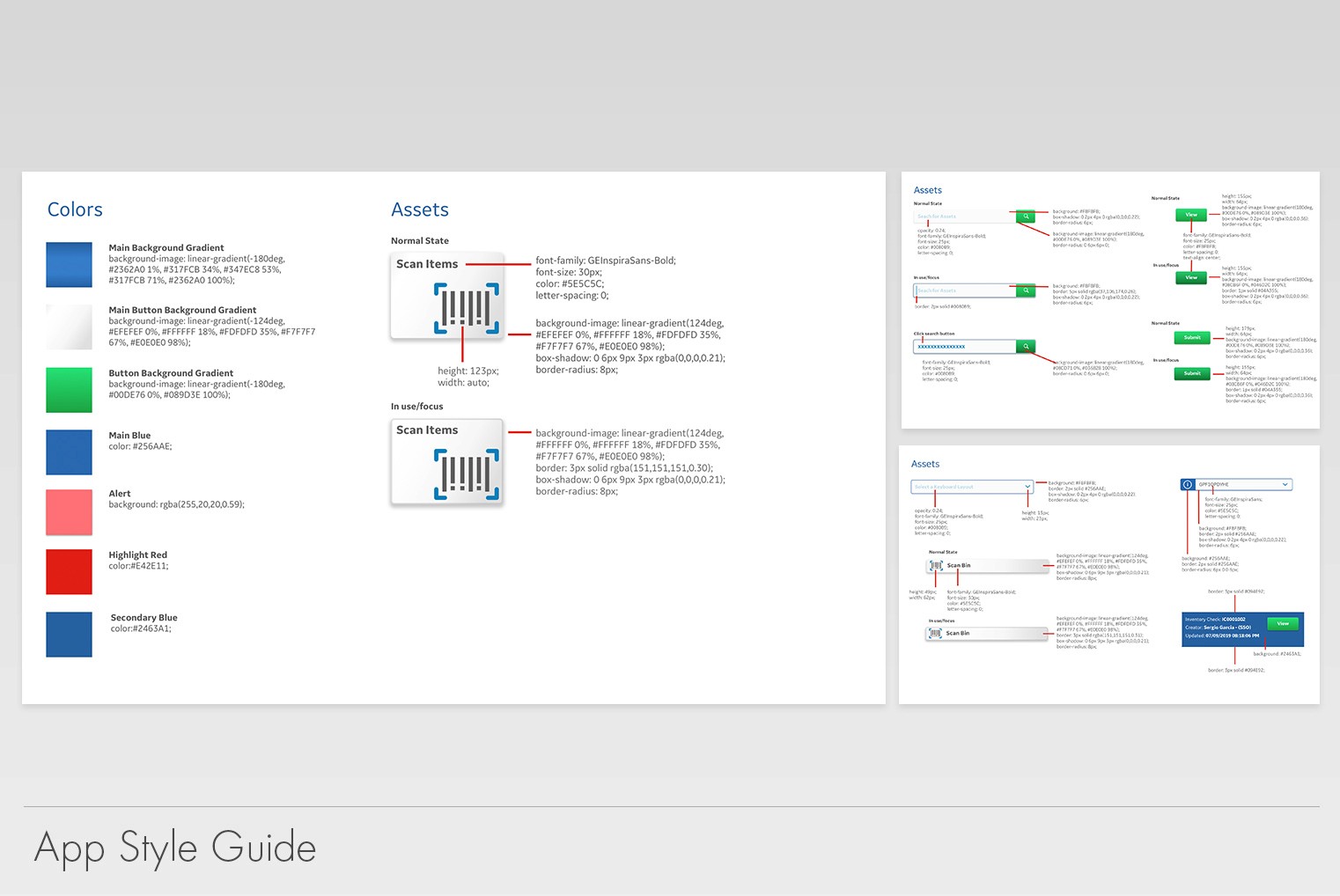
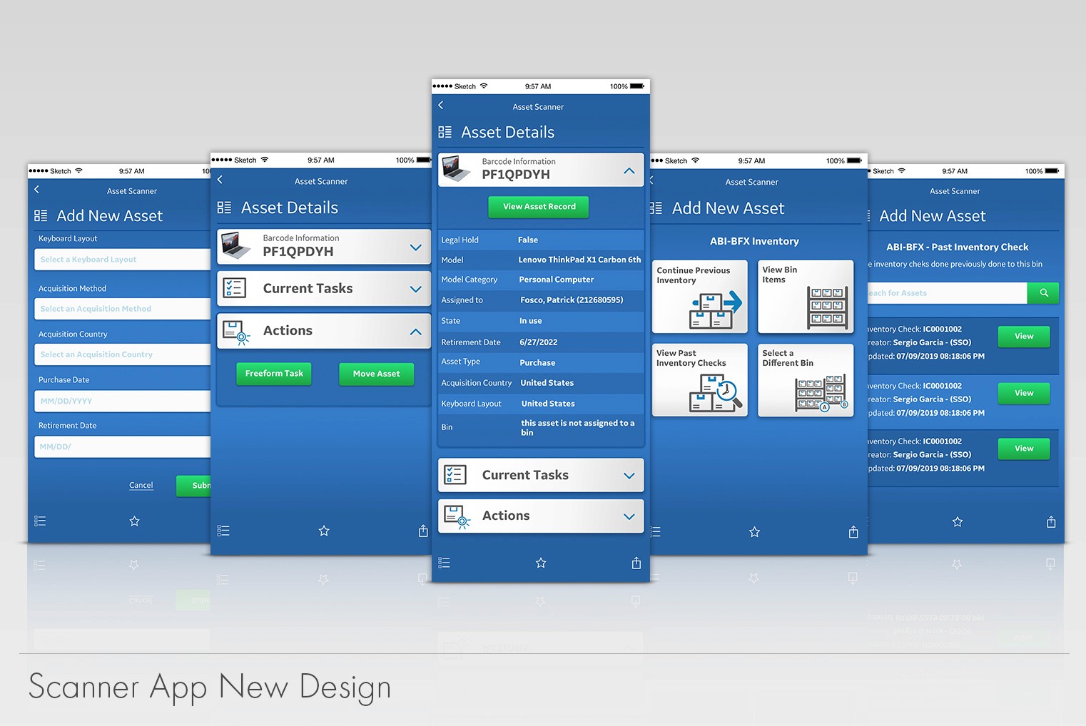
During the development process, we discovered an un-anticipated roadblock. Natively, the system had two blue bars (one at the top and one at the bottom) which the development team could not remove. It would be a large effort from them to find a custom solution. To solve this issue, I suggested to blend them in within the background. This is why the application has a blue gradient. Using the company’s branding colors, we were able to find a low effort/low-cost solution for our problem.
The iconography presented was developed with our users help. A vast verity of our user base is not native English speaker. It was important to us to make sure that even if they didn’t read or speak the language fluently, the imagery depicted could give them a sense of direction within the application.
The application architecture utilized ServiceNow desktop’s workflows. We made the decision to use it as is because the users were customed to it. For us it didn’t make sense to change it and create a learning curve for them. This decision kept us closer to the “out of the box” offerings from the platform.
During the development process, we discovered an un-anticipated roadblock. Natively, the system had two blue bars (one at the top and one at the bottom) which the development team could not remove. It would be a large effort from them to find a custom solution. To solve this issue, I suggested to blend them in within the background. This is why the application has a blue gradient. Using the company’s branding colors, we were able to find a low effort/low-cost solution for our problem.
The iconography presented was developed with our users help. A vast verity of our user base is not native English speaker. It was important to us to make sure that even if they didn’t read or speak the language fluently, the imagery depicted could give them a sense of direction within the application.
The application architecture utilized ServiceNow desktop’s workflows. We made the decision to use it as is because the users were customed to it. For us it didn’t make sense to change it and create a learning curve for them. This decision kept us closer to the “out of the box” offerings from the platform.
The Results
The Results
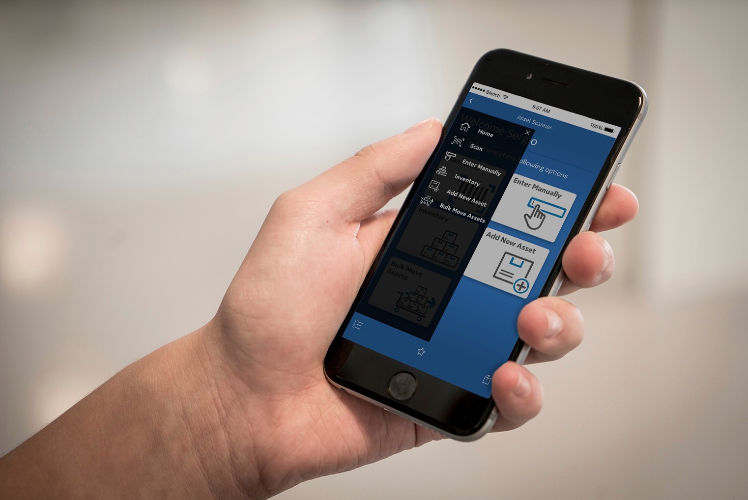
The team provided GE with an improved way to track assets and keep an eye on inventory levels. The depot no longer needed to manually enter the data, adding assets became faster and efficient. The company and asset mangers finally had a reliable source of truth.
Unfortunately, there isn’t any exact data to compare how things improved over time since the introduction of the application. The application has expanded in features and capabilities after my departure from the team. I have heard in the years after that this application is still around and being used by depot managers.