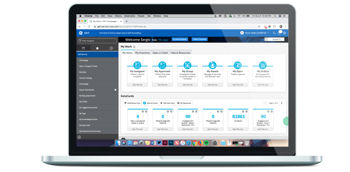
GEIT Servicenow hero image

GEIT ServiceNow

GEIT
ServiceNow

GEIT ServiceNow

General Electric | UX Designer

General Electric

UX Designer

General Electric | UX Designer

Prologue

Prologue

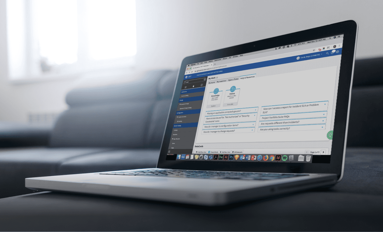
Servicenow desktop UI

ServiceNow is and has been the backbone of General Electric’s IT processes and requests. From small service operations to complete infrastructure redesigns, ServiceNow is one of the most important tools within the company. On a daily basis there are up to 15,000 users servicing tickets and fulfilling requests across the globe.

For many years, this tool was taken for granted and it missed a lot of critical updates, which left the company vulnerable to cyber-attacks and other risks. These issues stem from over customization throughout the years. We could no longer support all the processes created and could not meet the demands from our users to upgrade to the latest version. It was imperative that we modernize the tool and simplify everything by keeping the system operating as close as  “out of the box” as possible. This would eventually allow us to reduce technical debt and make upgrades a lot quicker. By this point it was taking us close to 6 to 8 months to make a single system update and we were behind 2 to 3 years’ worth of upgrades.

UX Goals

UX Goals

The company decided to assemble a UX team to help tackle the modernization to research and deliver the best possible experience while trying to minimize customization. Our goals were:


  • Improve its usability and mitigate pain points developed by the previous version.
    Keeping in mind some of the customizations and work arounds that some teams created.

  • Improve the user interfaces hierarchy, legibility, tone and iconography while leveraging the company's colors and branding.

  • Help with user engagement and promote ServiceNow to the organization.
    Keep open communication channels with our user base and collect feedback.

  • Work within what the system provided by staying “out of the box” as much as possible and minimize over customization.

  • Simplify workflows and create shortcuts for power users.

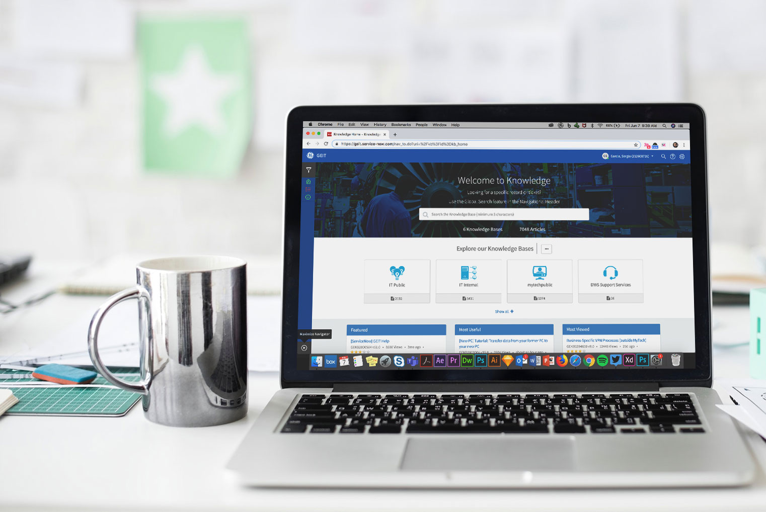
  • Develop and enhance IT’s ServiceNow knowledge base.

The company decided to assemble a UX team to help tackle the modernization to research and deliver the best possible experience while trying to minimize customization. Our goals were:


  • Improve its usability and mitigate pain points developed by the previous version.
    Keeping in mind some of the customizations and work arounds that some teams created.

  • Improve the user interfaces hierarchy, legibility, tone and iconography while leveraging the company's colors and branding.

  • Help with user engagement and promote ServiceNow to the organization.
    Keep open communication channels with our user base and collect feedback.

  • Work within what the system provided by staying “out of the box” as much as possible and minimize over customization.

  • Simplify workflows and create shortcuts for power users.

  • Develop and enhance IT’s ServiceNow knowledge base.

The company decided to assemble a UX team to help tackle the modernization to research and deliver the best possible experience while trying to minimize customization. Our goals were:


  • Improve its usability and mitigate pain points developed by the previous version.
    Keeping in mind some of the customizations and work arounds that some teams created.

  • Improve the user interfaces hierarchy, legibility, tone and iconography while leveraging the company's colors and branding.

  • Help with user engagement and promote ServiceNow to the organization.
    Keep open communication channels with our user base and collect feedback.

  • Work within what the system provided by staying “out of the box” as much as possible and minimize over customization.

  • Simplify workflows and create shortcuts for power users.

  • Develop and enhance IT’s ServiceNow knowledge base.

UX Contributors

UX Contributors

The Journey

The Journey

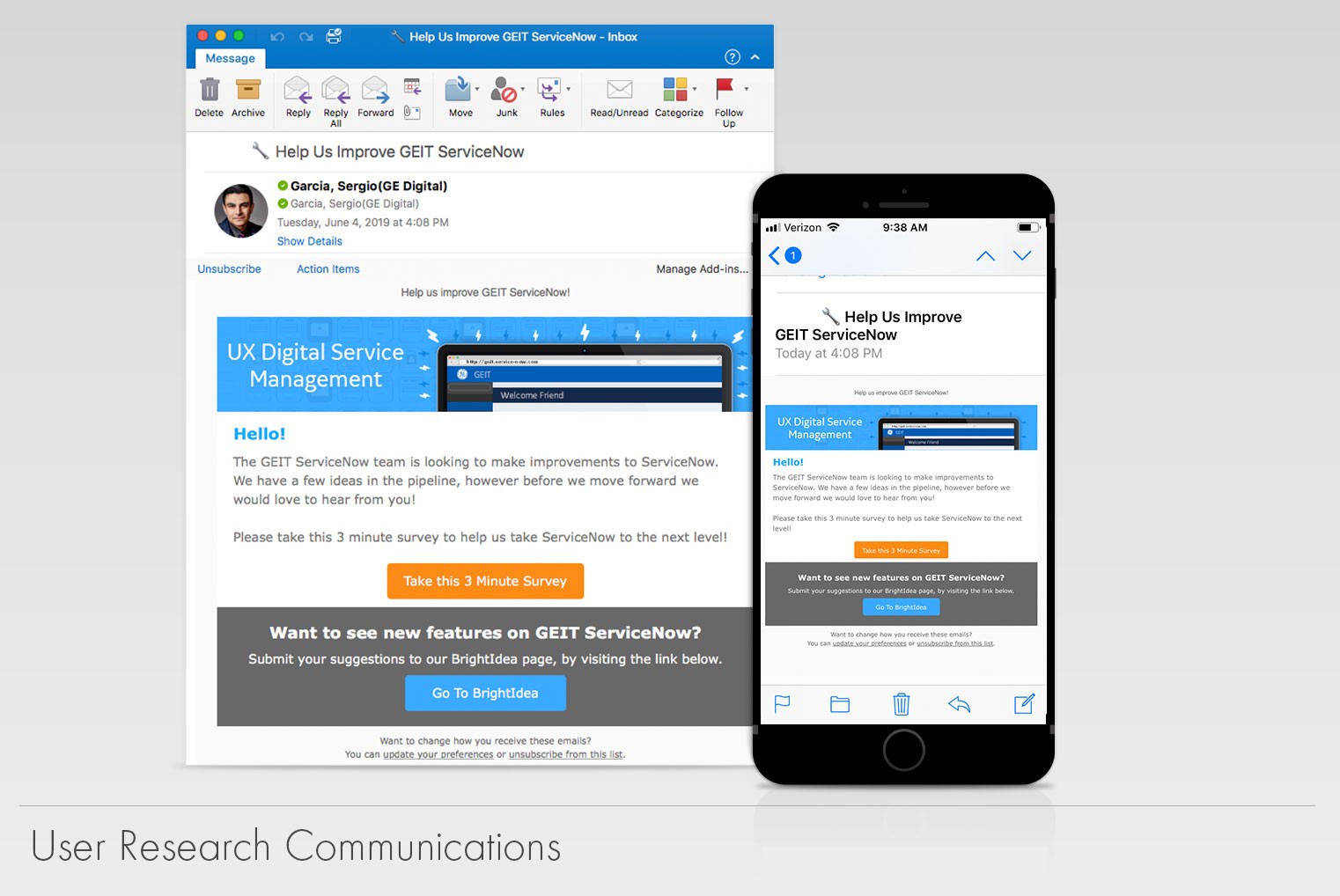
To solve the challenge we were facing, we first needed to gather user feedback. We interviewed users across multiple GE businesses to understand how they interacted with ServiceNow. We collected quantitative feedback via online surveys. We collected qualitative feedback via recording sessions in which we asked the users to walk us through their daily operations. As a result from our research, we grouped our users into personas so we could catalog the type of work they did and issues they were facing.


To track our feedback and keep our users engaged, we created a tool called Bright Ideas. This collection site allowed us to not only have a repository of all our feedback but it allowed us to hear first-hand what the users wanted and what they didn’t via a voting system.
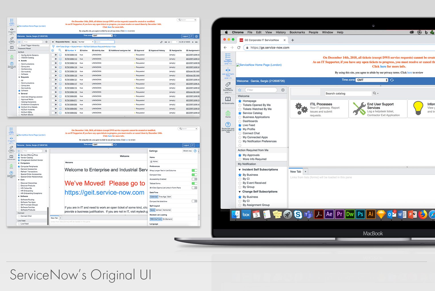
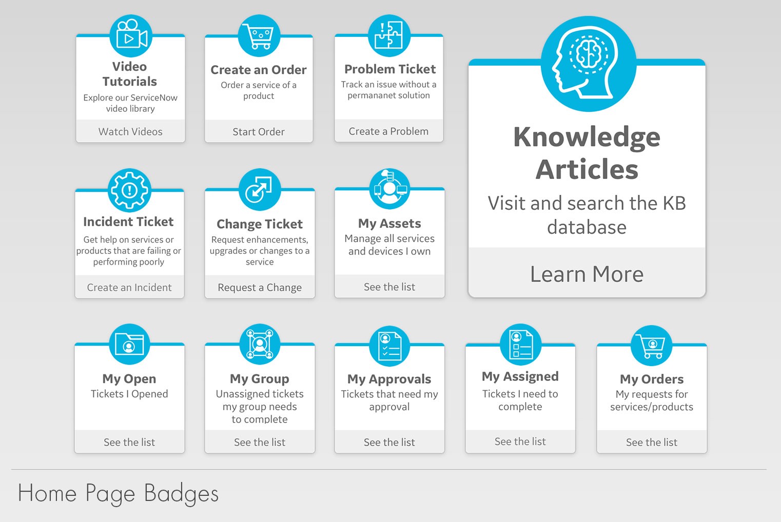
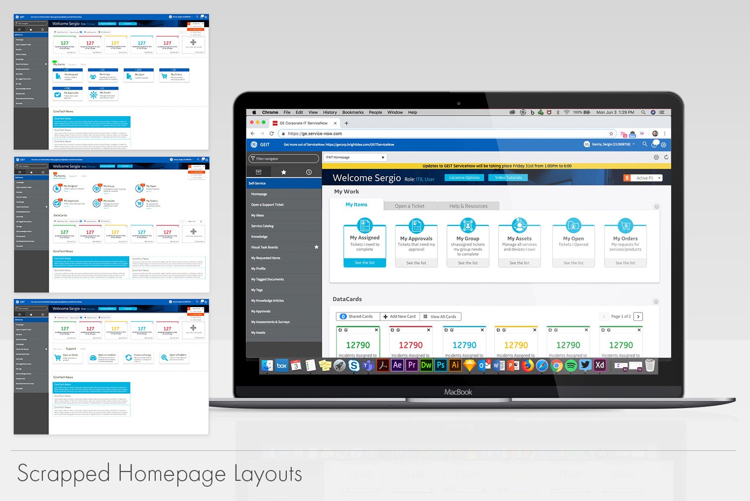
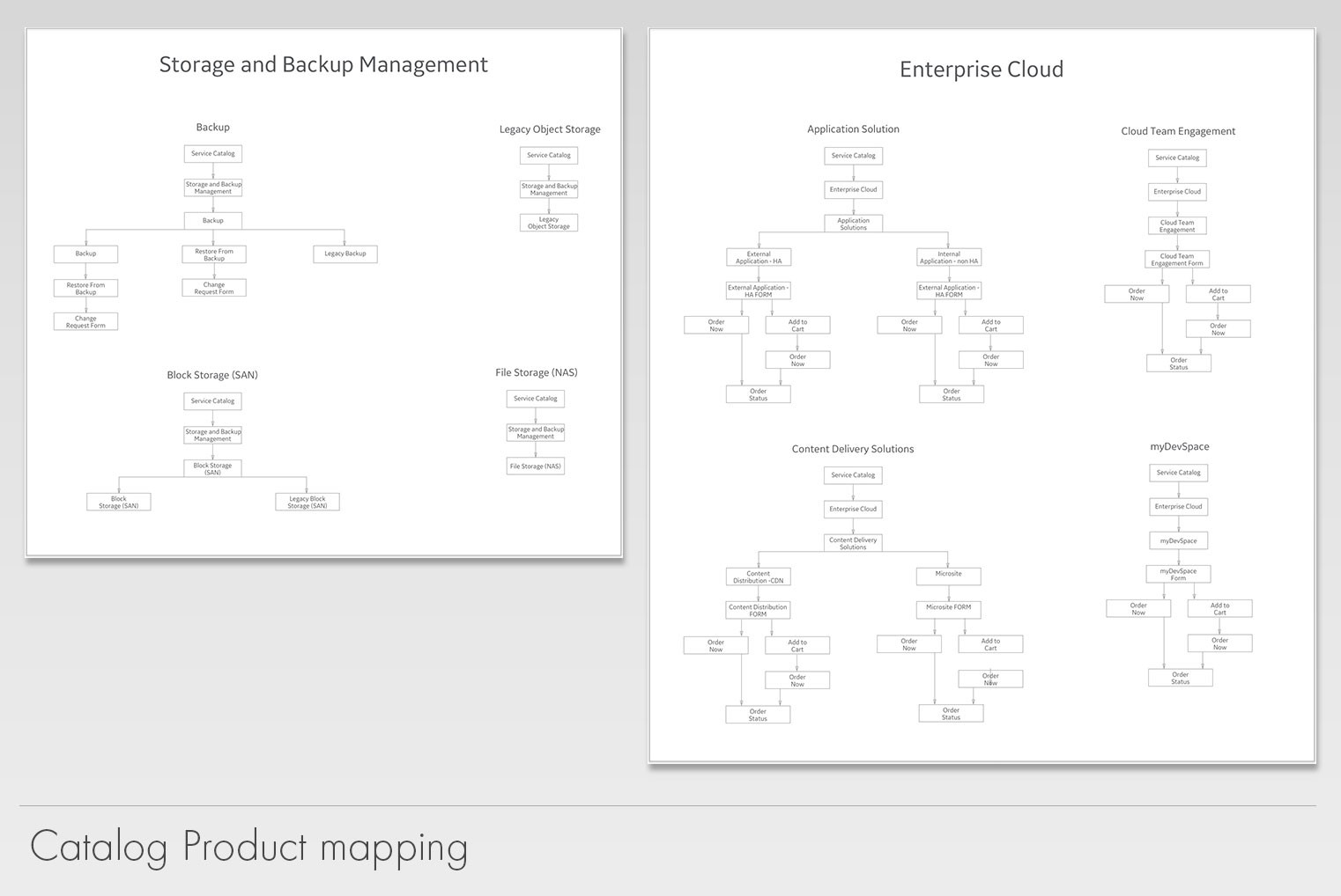
One of the early challenges we faced was fixing the navigation. Users didn’t seem to know where processes were housed and the search function was not helpful to them. As we worked on improving the navigation, we started to work on developing a new look that would align better with GE’s branding. During this phase, I developed a mix of low-fi wireframes and mock-ups. We tested different ideas with our users to arrive to what eventually be the final solution. With the help of our development team, we made decisions on which type of navigation, look and capabilities would be the best suited to meet our goals as a team and our user needs.


After a few iterations, we eventually found a compromise of what we could achieve with out of the box and what needed to be custom made.

For 6 months, we worked on not only updating the UI, simplifying processes but also created training materials. We needed to make sure everyone could follow and learn the new system. I shot 50 videos explaining new features, processes changes and workflows. These videos were added to our knowledge base to help future users learn the system. During this phase of the project, we worked using agile methodology in which we worked in 2-week sprints.


Upon a successful release of the new and improved ServiceNow. We kept asking our user base to help us determine what new features we needed to ad. The direct collaboration with our users not only built trust with them but we saw a spike in our NPS score. When this project began we had a lot of detractors and we were on the red. By the time I moved on from the project we were trending forward with positive results on the green spectrum.

For 6 months, we worked on not only updating the UI, simplifying processes but also created training materials. We needed to make sure everyone could follow and learn the new system. I shot 50 videos explaining new features, processes changes and workflows. These videos were added to our knowledge base to help future users learn the system. During this phase of the project, we worked using agile methodology in which we worked in 2-week sprints.


Upon a successful release of the new and improved ServiceNow. We kept asking our user base to help us determine what new features we needed to ad. The direct collaboration with our users not only built trust with them but we saw a spike in our NPS score. When this project began we had a lot of detractors and we were on the red. By the time I moved on from the project we were trending forward with positive results on the green spectrum.

GEIT ServiceNow Final Redesign

The Results

The Results

ServiceNow live image

The ServiceNow upgrade and redesign were a total success. We were able to cut upgrade time from 6 to 8 months to a total of 2 to 3 weeks. We now have minimized downtime for a release to half a day when it used to take weeks. This translated in decrease development time and costs. We were much more secure and if we needed help from our vendor, we were able to get it as they didn’t have to navigate through custom workflows.

Adding features can be done within one or two sprints instead of months. Visually, ServiceNow looks a lot more polished and modern. The users adopted the new UI very well and gave us praised for simplifying it.

The ServiceNow upgrade and redesign were a total success. We were able to cut upgrade time from 6 to 8 months to a total of 2 to 3 weeks. We now have minimized downtime for a release to half a day when it used to take weeks. This translated in decrease development time and costs. We were much more secure and if we needed help from our vendor, we were able to get it as they didn’t have to navigate through custom workflows.


Adding features can be done within one or two sprints instead of months. Visually, ServiceNow looks a lot more polished and modern. The users adopted the new UI very well and gave us praised for simplifying it.

Find me on the interwebs

Sergio Garcia copyright 2010-2026. | All rights reserved | Sitemap

From Ohio with love

Find me on the interwebs

Sergio Garcia copyright 2012-2024

All rights reserved | Sitemap

From Ohio with love