Quote Flow Hero

Quote Flow

Quote Flow

Coterie Insurance | UX Lead

Coterie Insurance | UX Lead

Quote Flow Hero

Quote Flow

Coterie Insurance

UX Lead

Prologue

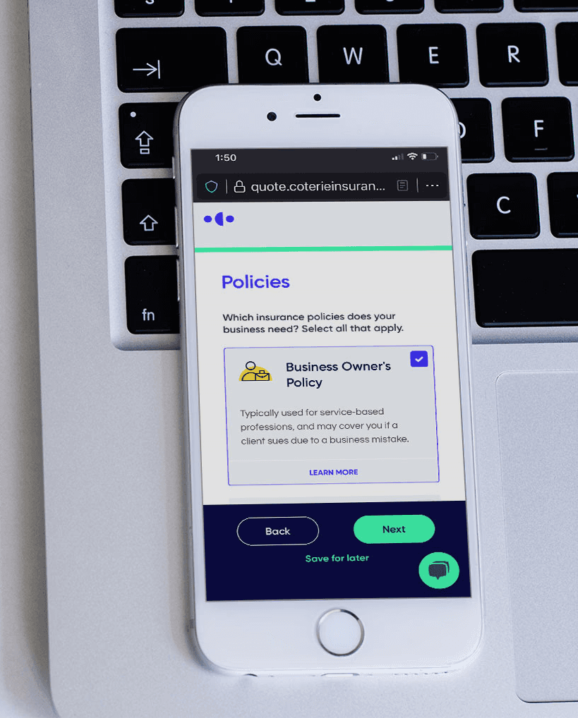
Quote flow on mobile and desktop

Quote Flow was Coterie’s first branded digital product geared towards small businesses (the Agent Dashboard was geared towards independent insurance agents). Its purpose was to provide small businesses with a self-service system that could generate a quote in minutes without having to work directly with an agent. Quote Flow uses the business’ historical data pulled from multiple sources (such as Quickbooks) to generate a quote and provide the user with coverage and add-ons suggestions.

UX Goals

UX Goals

  • Provide the product with proper branding and a voice different from our competitors.

  • Create a consistent experience that felt as part of the Coterie application ecosystem.

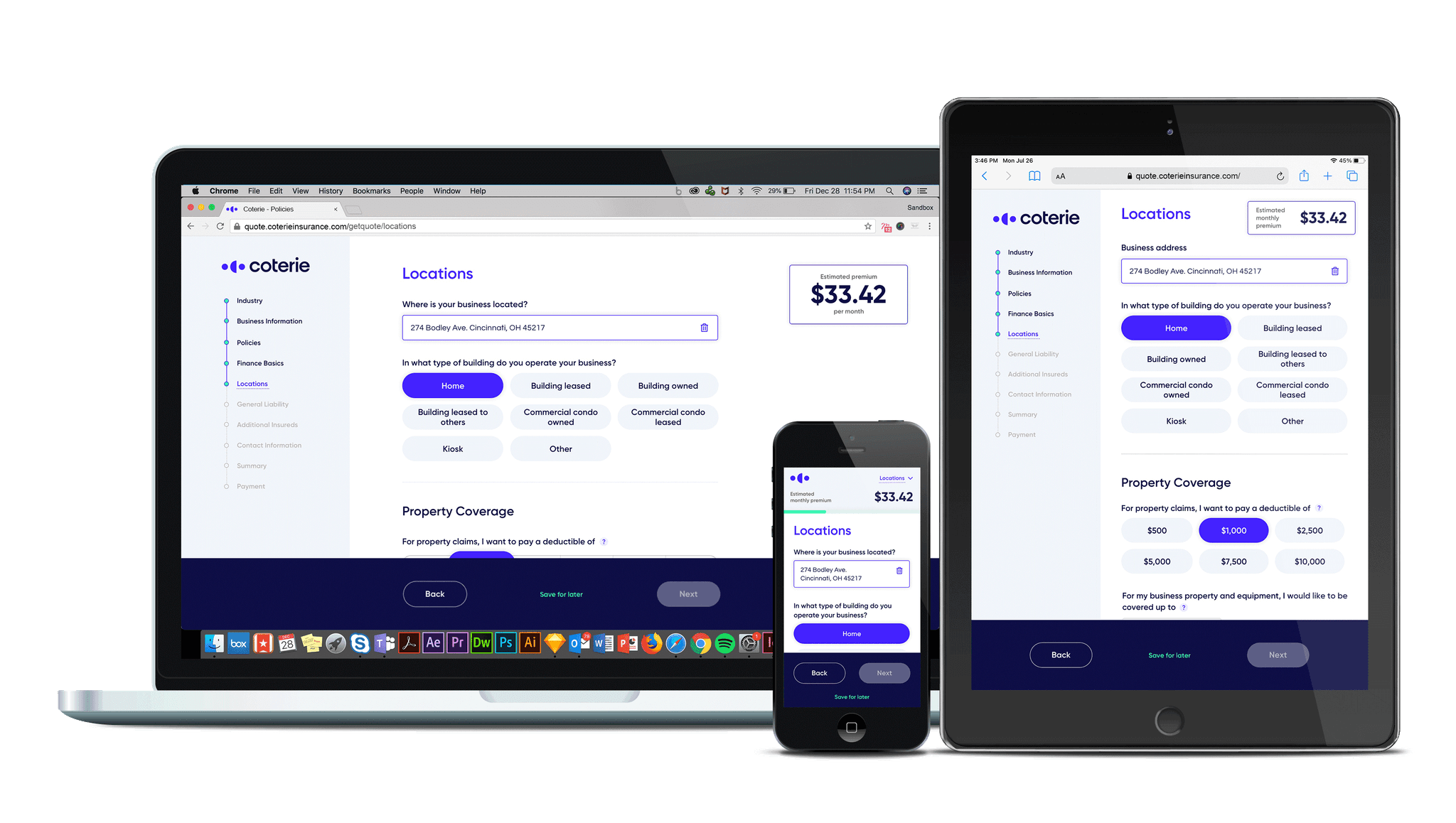
  • Ensure the product was responsive and would be able to perform in desktop, tablet and mobile devices.

  • Make the application scalable for future features and new workflows.

  • Make the product WCAG 2.1 Level AA compliant.

  • Provide the product with proper branding and a voice different from our competitors.


  • Create a consistent experience that felt as part of the Coterie application ecosystem.


  • Ensure the product was responsive and would be able to perform in desktop, tablet and mobile devices.


  • Make the application scalable for future features and new workflows.


  • Make the product WCAG 2.1 Level AA compliant.

UX Contributors

UX Contributors

The Journey

The
Journey

Upon my arrival, the platform had a steady grow and kept adding features, however it was obvious that still was in the early stages. I noticed that it had inconsistencies around the look, tone, voice and workflows. Assets were mismatched, had buttons of all sizes and had hierarchy issues. The mobile experience was atrocious and it needed visual polishing to be able to outperform our competitors. As the company was starting to get more visibility and more funding it was imperative that we improve the overall experience of this product.


I was the first user experience designer the company had in staff. I started as an individual contributor until I was able to hire my team. Due to the number of projects on deck, my contributions were from an art/UX director role. I owned the vision; however, I was not the one building assets full time. My team consisted of one full-time designer, a part-time designer, a project manager and a small development team of 4 people.
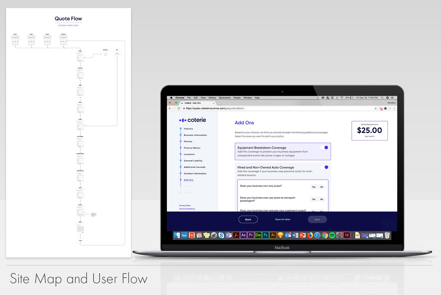
Site map and user flow
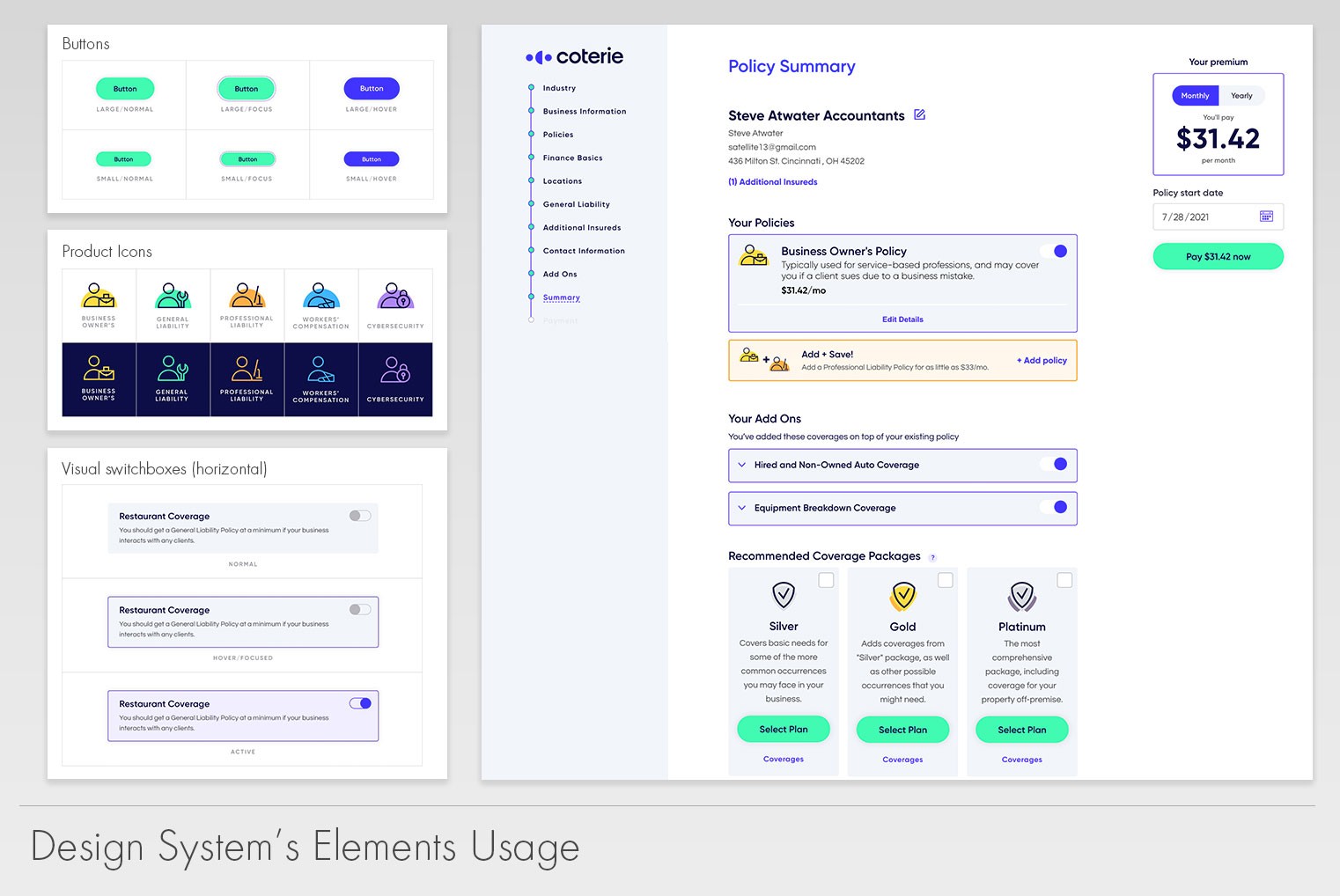
Design system in action

The first task we tackled was building a design system that would perform across all products within the company. I wanted consistency and this would save us time in the future as we didn’t have to re-invent the wheel every single time we started building a new product or adding features. This was the first project that would benefit from such system. The team’s focus was to deliver consistency and meet accessibility standards. Due to team size and timelines given, we were both building the design system as we were building the application itself.


Quote Flow’s main goal was simple, make getting a quote quick and easy regardless of the device they were accessing it and regardless of the level of experience the users had with business insurance.


Data drove our decisions not only from the analytics standpoint but via user surveys and discussions with the SMEs the company had in staff. My priority was to find a good balance between user needs/wants and what the sales team and underwriters needed.

The first task we tackled was building a design system that would perform across all products within the company. I wanted consistency and this would save us time in the future as we didn’t have to re-invent the wheel every single time we started building a new product or adding features. This was the first project that would benefit from such system. The team’s focus was to deliver consistency and meet accessibility standards. Due to team size and timelines given, we were both building the design system as we were building the application itself.


Quote Flow’s main goal was simple, make getting a quote quick and easy regardless of the device they were accessing it and regardless of the level of experience the users had with business insurance.


Data drove our decisions not only from the analytics standpoint but via user surveys and discussions with the SMEs the company had in staff. My priority was to find a good balance between user needs/wants and what the sales team and underwriters needed.

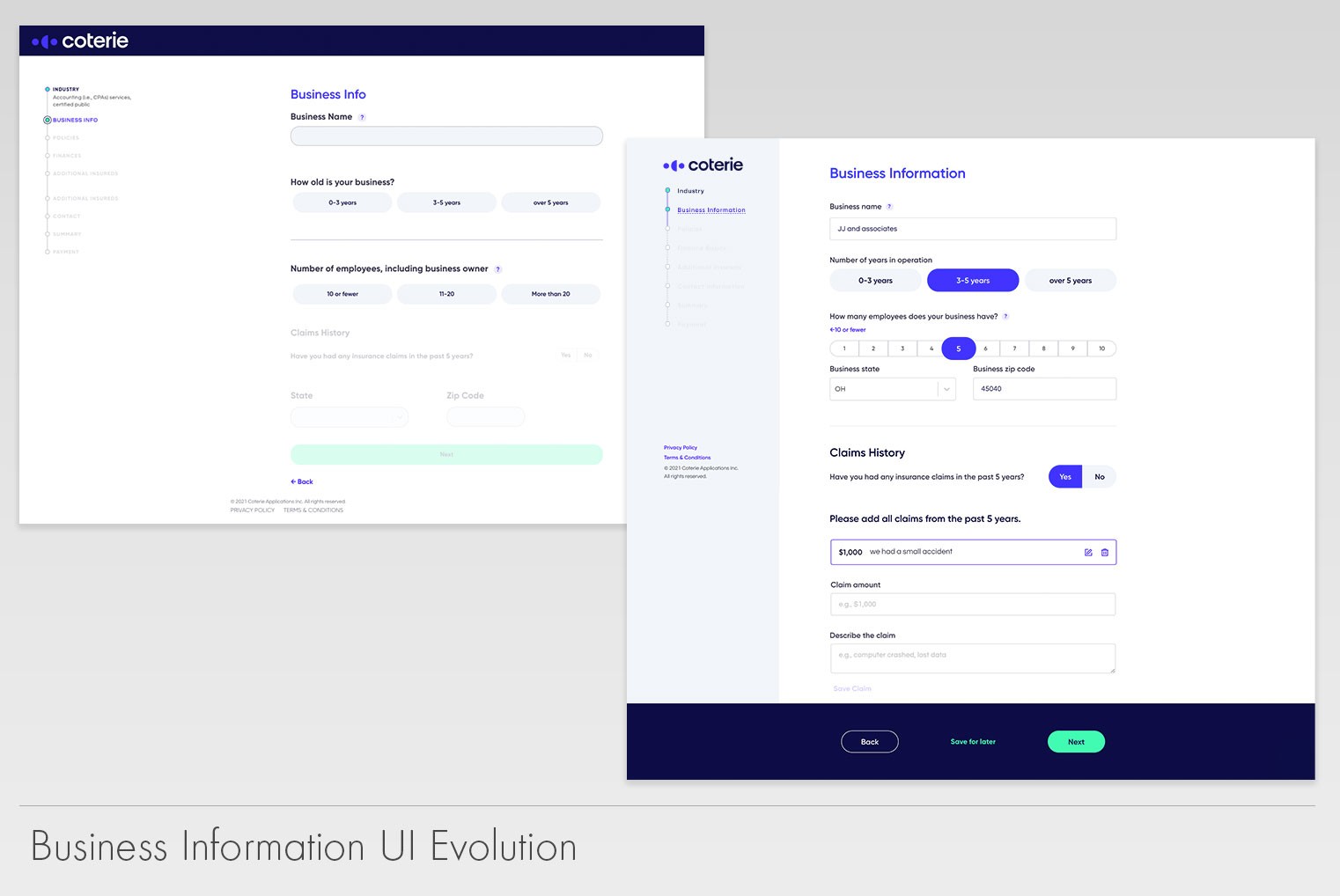
Business information UI evolution
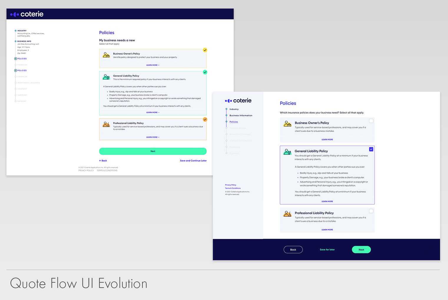
Quote Flow before and after

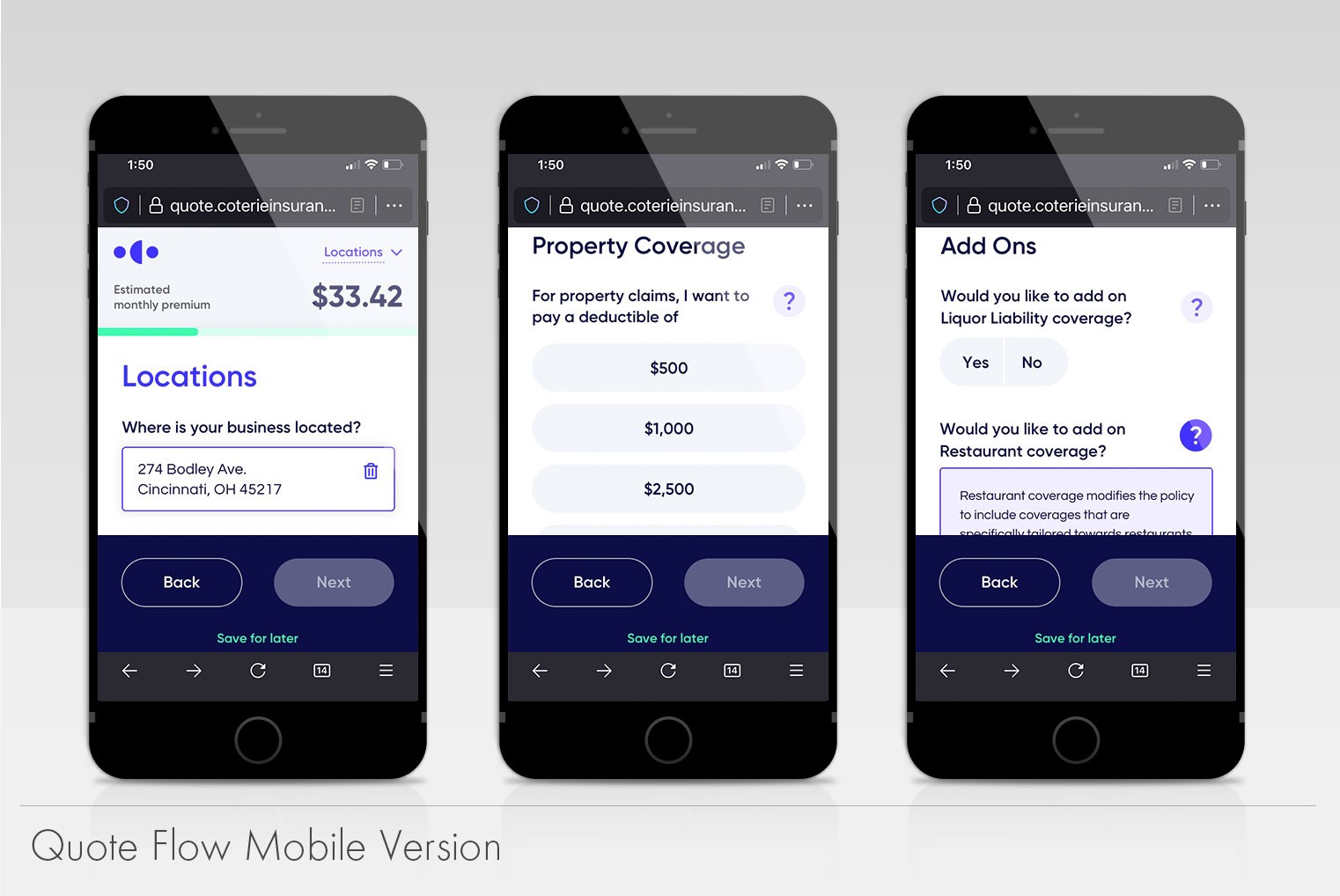
Based on branding, our print campaigns (which I oversaw) and our marketing, we focused on giving Quote Flow a friendly tone of voice. We wanted the application to feel like a friend guiding you rather than a cold traditional agent selling you a policy. It had to be simple and friendly, but robust enough to gain our user’s trust. Modals and errors messages were revamped to help our user pinpoint their mistakes and lower frustration. Technical language was made more accessible by changing the tone of the writing and adding tool tips when certain terminology seemed challenging.


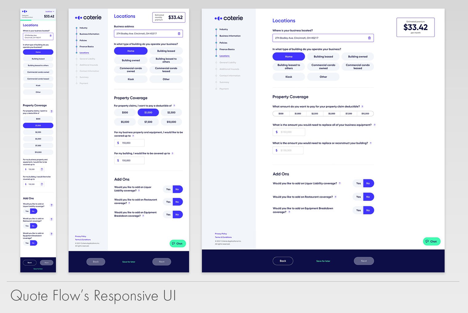
We design our application using mobile approach first. We made sure every part of the workflow was responsive and would scale properly across devices. If we were going to be selling quotes 24/7 we needed to be accessible anywhere and everywhere.


The changes we applied from when I joined to when it was delivered were drastic. Interactions were sharp, the application was polished and we found balance between branding colors and the accessibility we were looking to achieve.

Based on branding, our print campaigns (which I oversaw) and our marketing, we focused on giving Quote Flow a friendly tone of voice. We wanted the application to feel like a friend guiding you rather than a cold traditional agent selling you a policy. It had to be simple and friendly, but robust enough to gain our user’s trust. Modals and errors messages were revamped to help our user pinpoint their mistakes and lower frustration. Technical language was made more accessible by changing the tone of the writing and adding tool tips when certain terminology seemed challenging.


We design our application using mobile approach first. We made sure every part of the workflow was responsive and would scale properly across devices. If we were going to be selling quotes 24/7 we needed to be accessible anywhere and everywhere.


The changes we applied from when I joined to when it was delivered were drastic. Interactions were sharp, the application was polished and we found balance between branding colors and the accessibility we were looking to achieve.

Phone version of Quote Flow
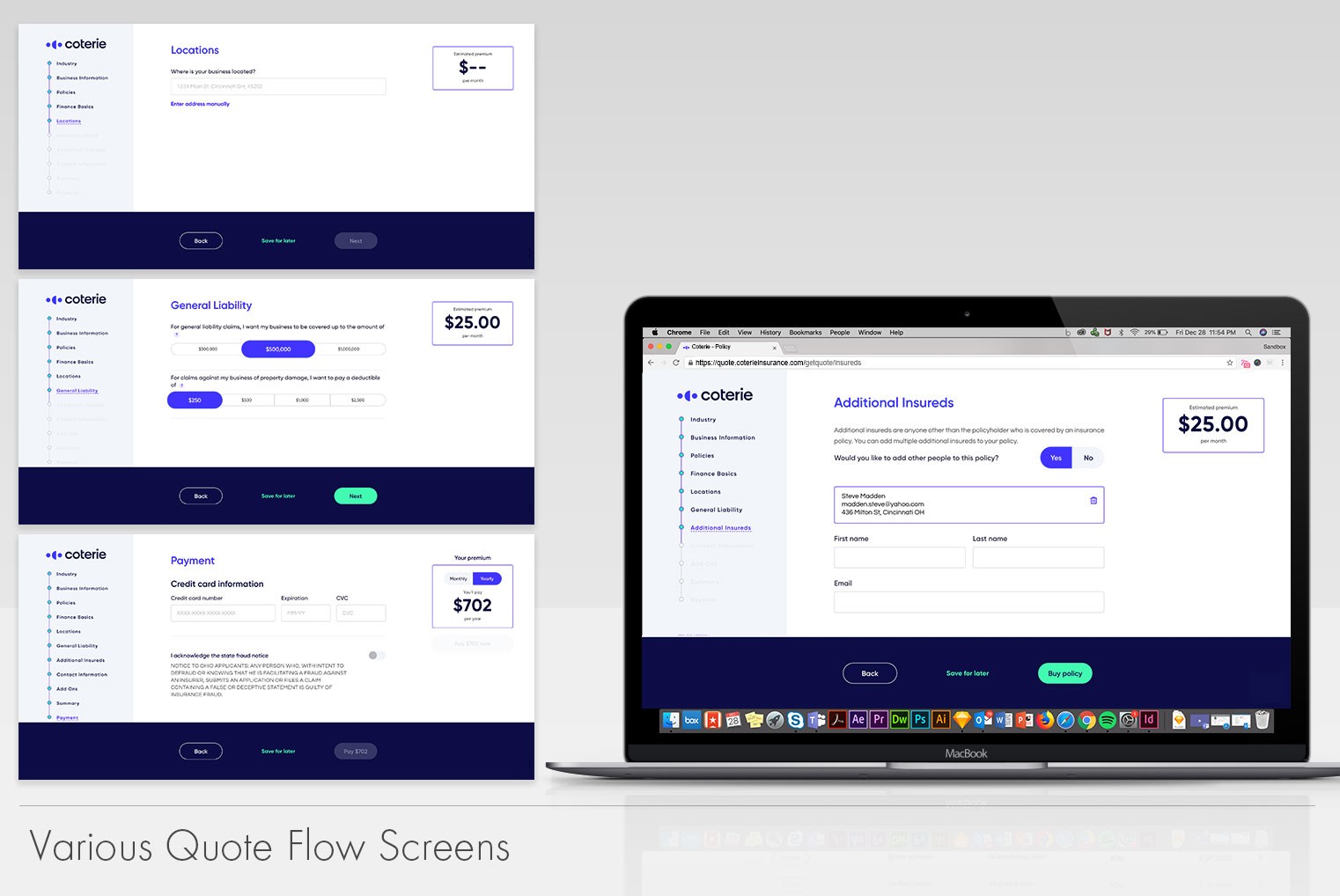
Multiple quote flow screens

The Results

The
Results

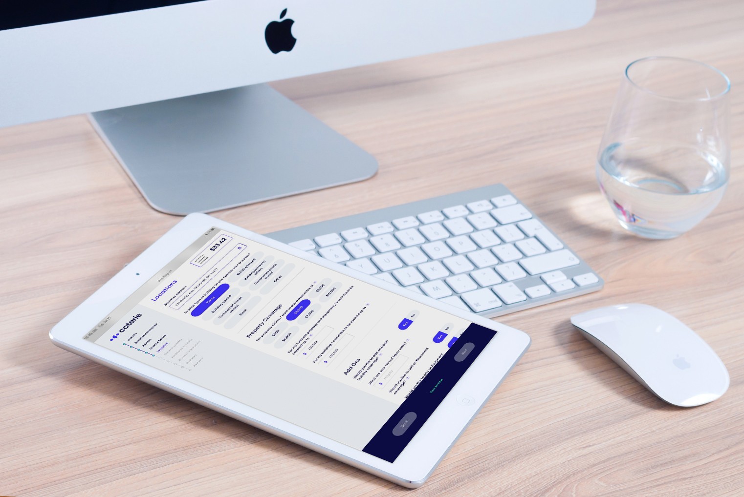
Quote flow on an iPad

The version of Quote Flow that my team build was far superior to the predecessor. We built it with the idea that eventually it might need to scale up, so we left room for that. The usage of our design system gave us the consistency I was seeking and reduced production time as the designers could reuse all the assets as needed.


Unfortunately, we don’t have data to benchmark the success of this effort as this was the first iteration. However, the redesign allowed us to spin off a white label version. This came to be from company partner’s feedback in which they wanted to embed Quote Flow into their own portals. We eventually got to the point in which we could stand up a version that used our back-end API but visually was tailored to match the partner’s branding while maintaining a close voice and feel. We had to be doing something right if other companies wanted to put our application into theirs!

The version of Quote Flow that my team build was far superior to the predecessor. We built it with the idea that eventually it might need to scale up, so we left room for that. The usage of our design system gave us the consistency I was seeking and reduced production time as the designers could reuse all the assets as needed.


Unfortunately, we don’t have data to benchmark the success of this effort as this was the first iteration. However, the redesign allowed us to spin off a white label version. This came to be from company partner’s feedback in which they wanted to embed Quote Flow into their own portals. We eventually got to the point in which we could stand up a version that used our back-end API but visually was tailored to match the partner’s branding while maintaining a close voice and feel. We had to be doing something right if other companies wanted to put our application into theirs!

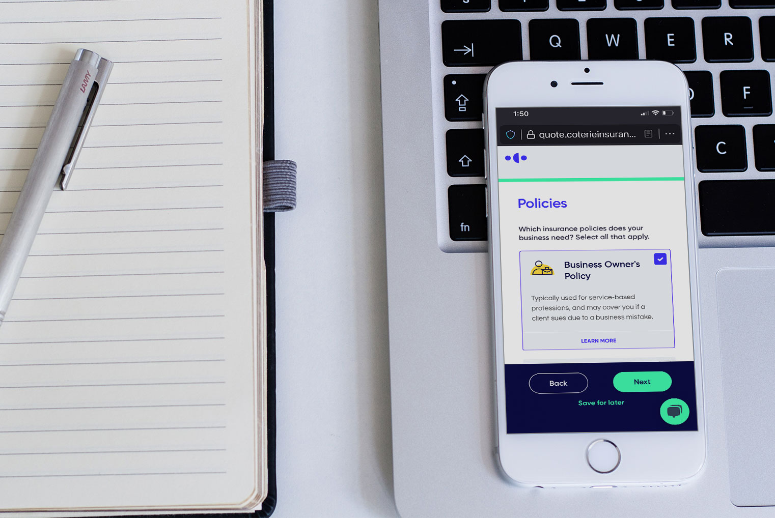
Phone version of Quote Flow
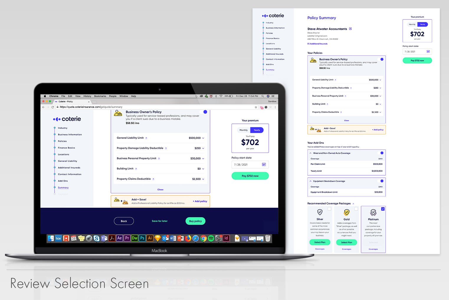
Selection review screen UI

Find me on the interwebs

Sergio Garcia copyright 2010-2026. | All rights reserved | Sitemap

From Ohio with love

Find me on the interwebs

Sergio Garcia copyright 2012-2024

All rights reserved | Sitemap

From Ohio with love