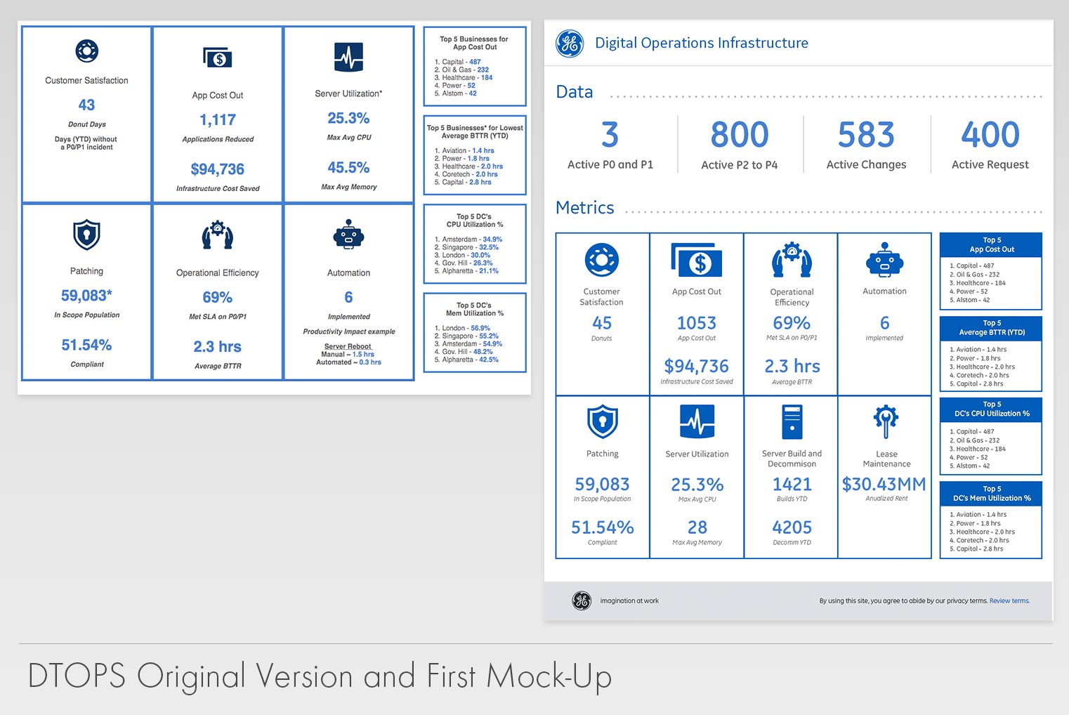
At the beginning of the project, there were only 6 metrics that were requested, but as we talked more with executives, we discovered that there were other metrics we had to add. We studied how they were consuming this data, which helped us put emphasis on how the information was going to be displayed (hierarchy, screen size, leaderboards).
The dashboard would go through a lot of iterations as the requests from executives kept increasing. Originally, we had only planned to do one dashboard for the entire company. However; as more people started leveraging this tool, we added a view into each specific business within GE. This feature allowed our users to dive deeper into each business and see how others were doing. We added other features in which business leaders in that owned certain metrics could be reached out for questions or concerns.


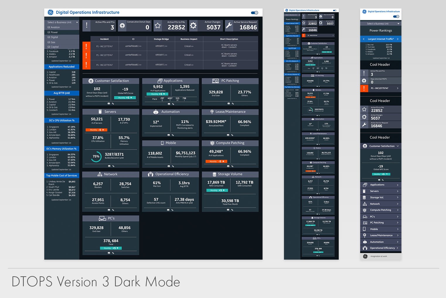
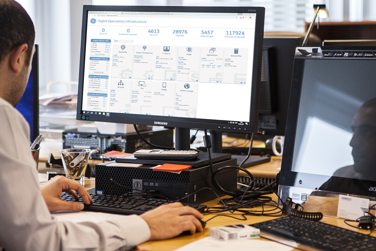
The dashboard was well received across the company. Many executives kept it open on of their dual screens to get real time data (data was refreshed every 1 minute). There was a lot of feedback asking for new features. Eventually, we reached a point where we started working on a 3rd version of the dashboard! This new version would incorporate all the previous metrics, but would allow for dark and light themes as well as include charts with trending data. Sadly, due to developers leaving the team and some executive changes, we never got the opportunity to deploy the next version.