APM Analysis redesign

APM Analysis

GE Vernova | Lead UX Designer

APM Analysis redesign

APM Analysis

GE Vernova | Lead UX Designer

APM Analysis redesign

APM
Analysis

GE Vernova

Lead UX Designer

Prologue

Prologue

Servicenow desktop UI

Asset Performance Management (APM) software suite is an on-prem and cloud based platform which enables increased reliability, decreases maintenance costs, lowers risk, and accelerates decarbonization efforts. One of APM's module offerings is called Analysis.


The Analysis module provides engineers with real-time analytics used to address current or potential health issues a plant (electric, hydro, wind, etc.) may encounter. APM monitors the different assets that make up the DNA of the premise, collects the data and surfaces those data points into the application. Analysis displays all the different data points collected in different chart formats.


This tool has been around for close to a decade, however through the years it has not received a proper facelift or significant tech updates. Analysis started to show its age by looking dated and present major problems as it couldn't be updated with new tech stacks. It became quiet challenging to add new features required by our internal and external user base.

The application was in such a critical state that revitalizing it was originally planned to take between 6 to 8 months. The reality became an ongoing multiyear effort to get it to where it is today.

UX Goals

UX Goals

  • Improve its usability, tool discoverability and maximize the space (user's wanted more space for charting and less for tools).

  • Leverage the new design system as much as possible except for instances in which components didn’t exist.

  • Improve the workflows and reduce the amount of clicks needed to complete each step.

  • Connect the two different data types (TimeSeries data and SmartSignal analytics) into a single coherent experience.

    • Both chart types and capabilities needed to "co-mingle" rather than existing in two separate versions of Analysis.

  • Improve its usability, tool discoverability and maximize the space (user's wanted more space for charting and less for tools).

  • Leverage the new design system as much as possible except for instances in which components didn’t exist.

  • Improve the workflows and reduce the amount of clicks needed to complete each step.

  • Connect the two different data types (TimeSeries data and SmartSignal analytics) into a single coherent experience.

    • Both chart types and capabilities needed to "co-mingle" rather than existing in two separate versions of Analysis.

  • Improve its usability, tool discoverability and maximize the space (user's wanted more space for charting and less for tools).

  • Leverage the new design system as much as possible except for instances in which components didn’t exist.

  • Improve the workflows and reduce the amount of clicks needed to complete each step.

  • Connect the two different data types (TimeSeries data and SmartSignal analytics) into a single coherent experience.

    • Both chart types and capabilities needed to "co-mingle" rather than existing in two separate versions of Analysis.

UX Contributors

UX Contributors

The Journey

The
Journey

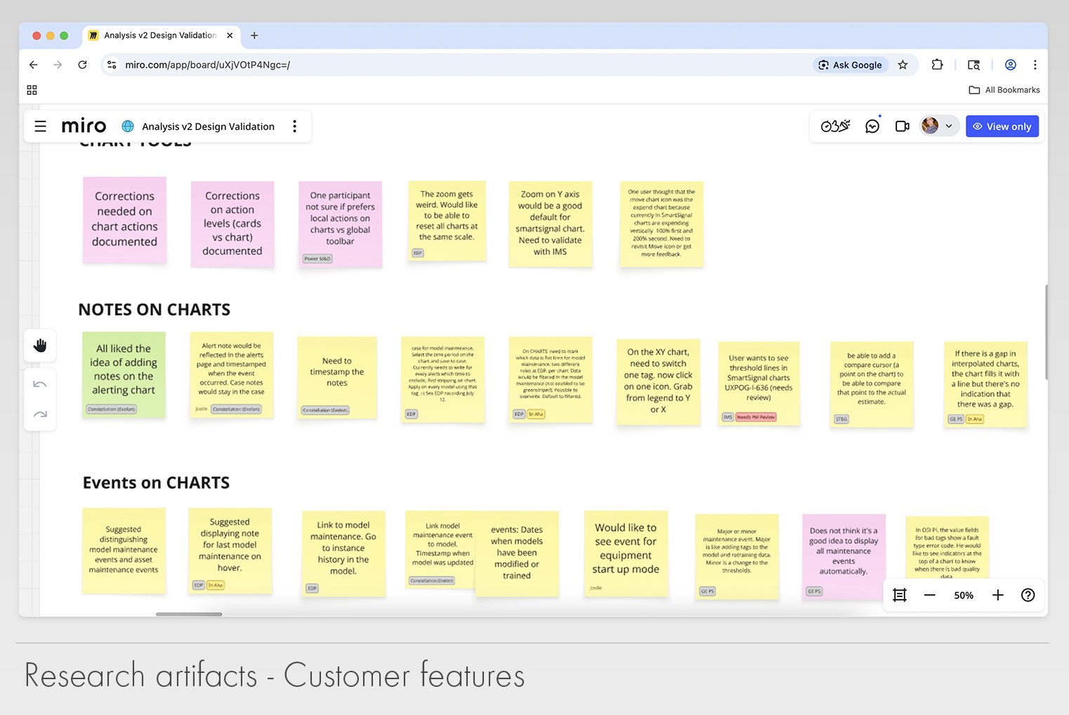
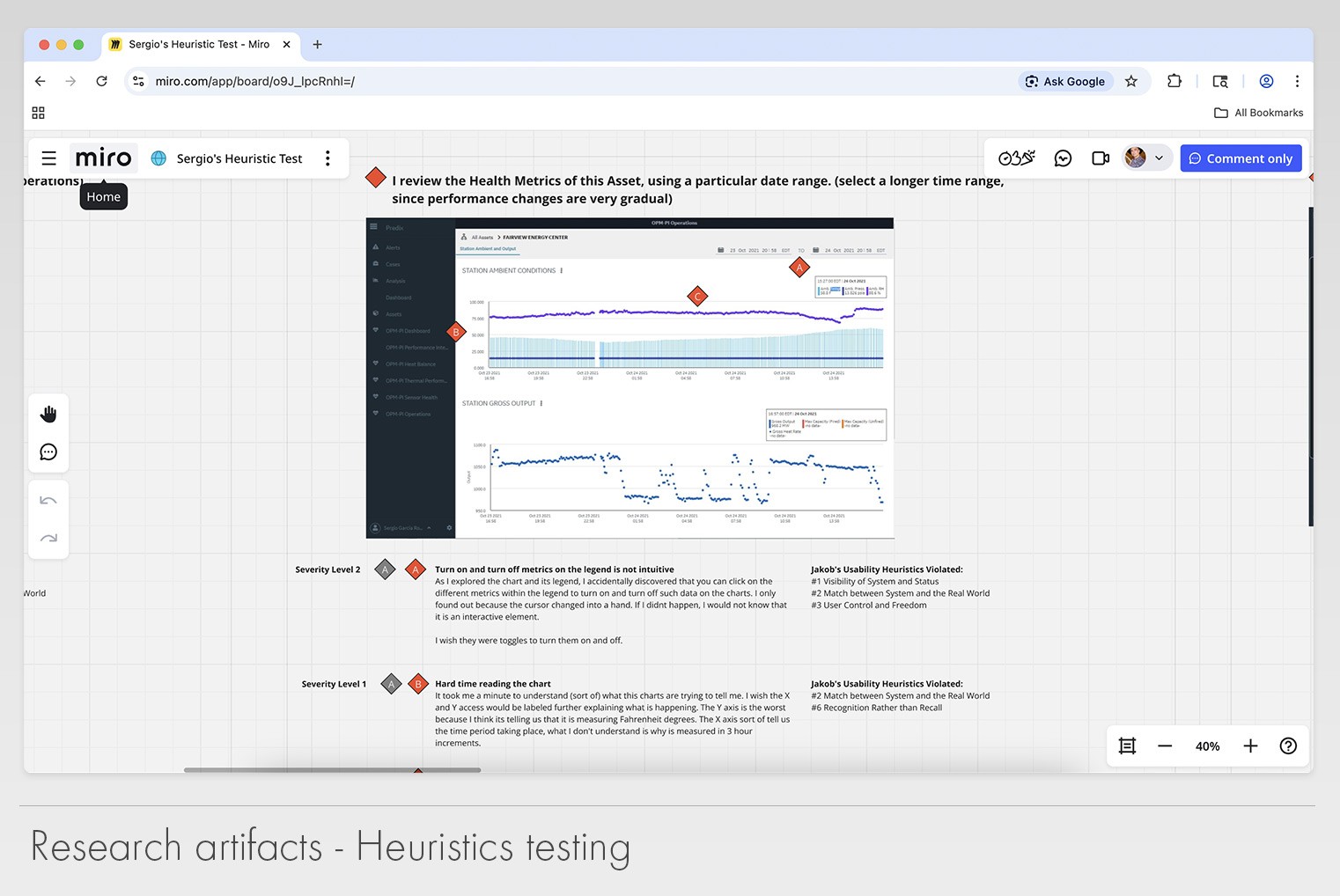
During the early stages of this project, I was tasked to help our staff UX researcher to collect data (pain points, user personas, technical challenges, etc.), interview users and generate artifacts that could help us build a better version of the application. For 6 to 8 months we work in tandem collecting the data, creating low fidelity wire frames and testing our initial hypothesis.
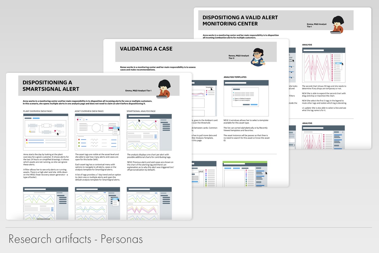
Analysis personas
Analysis personas
Analysis heuristics testing
Analysis customer features research
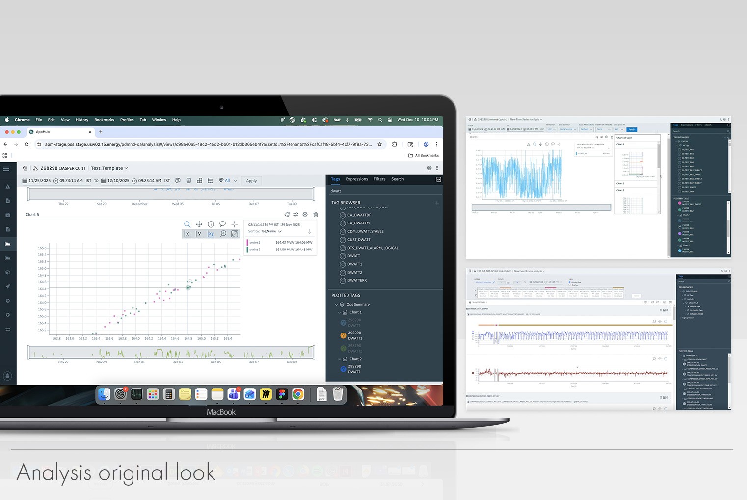
Analysis original look

Once we had all the necessary data, I was tasked to start developing the initial UI. Unfortunately, soon after; our research retired. That left me as the lead designer for this project.

It didn’t take to long for us to face some challenges. As the new designs were coming along, the organization started a new initiative that would affect directly the UI and the overall experience. The UX team was in the early stages of introducing a new design system called DEX. I was asked to incorporate DEX into Analysis. This was a challenge because we had a mandate to adopt a design system that was not ready to be consumed (it was being designed and developed as Analysis was going through its redesign).

In order to fulfill what the organization was asking for, I was forced to design Analysis with a “proto” version of the design system. The constant changes were creating a lot of rework on the development team. Product mangers, myself and development had to come to an agreement on this as it was not sustainable. We accepted the technical and design debt we would incur by doing this which in return would reduce the amount of constant rework early in the process.
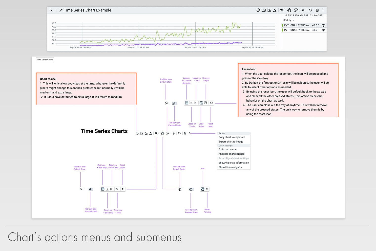
Analysis icons and menus blueprints
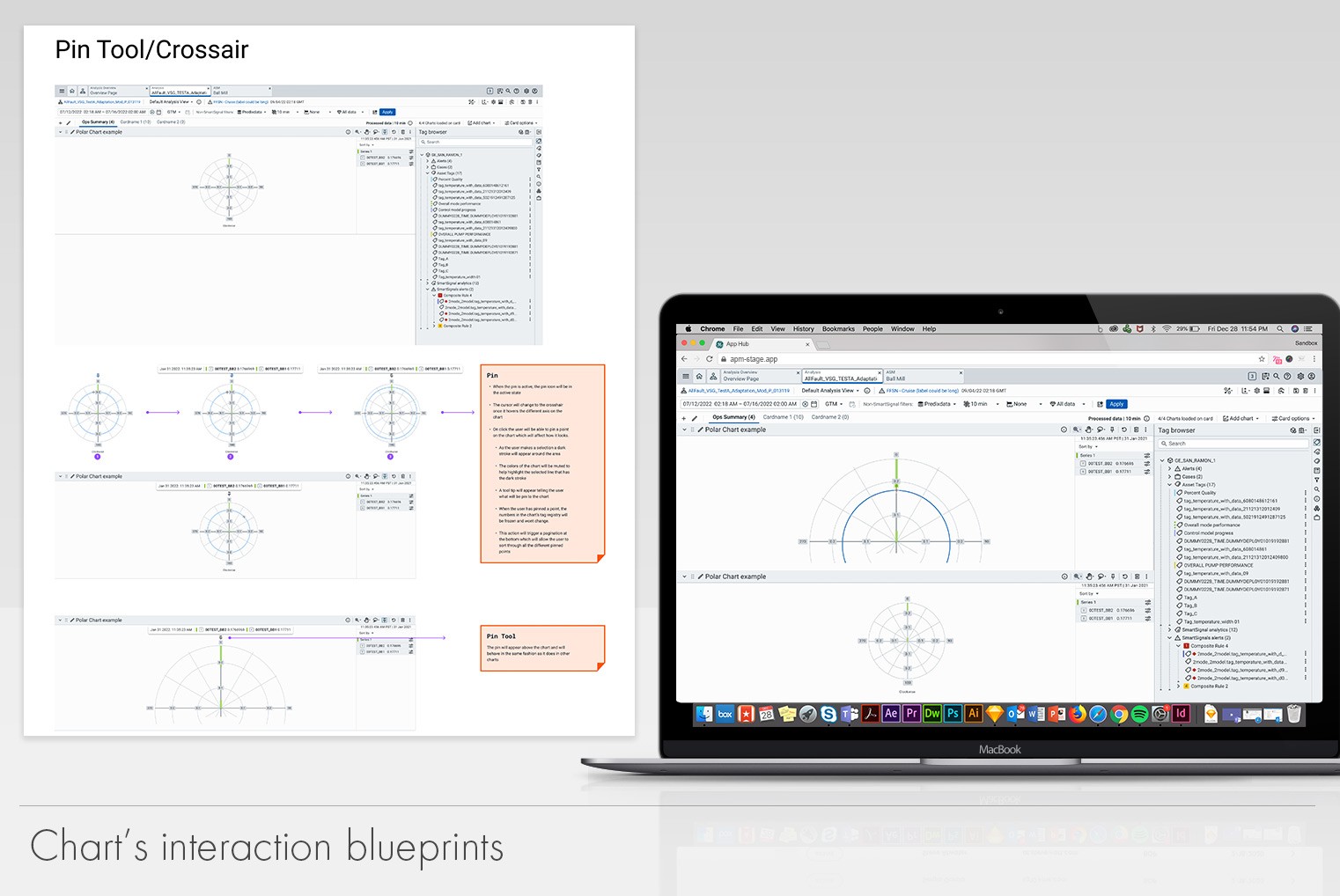
Analysis chart's interaction blueprints

As the project continued to move forward, I worked alongside our SMEs (subject matter experts), to create detailed blue prints for how we wanted the application to operate. This included every tool bar, chart type and interaction. All the documentation and artifacts I created helped the development team scope the work and develop it accordingly. In some cases, we made changes the design to accommodate technical challenges that would be appear due to the tech stack used.
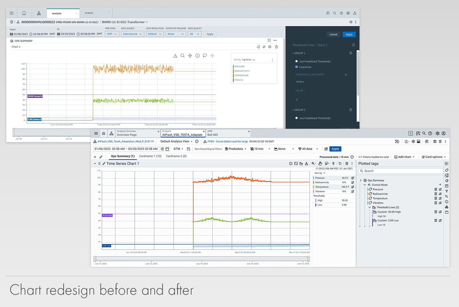
Analysis chart redesign examples
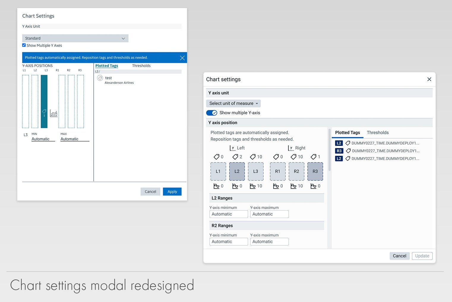
Analysis settings redesigned

The Results

The
Results

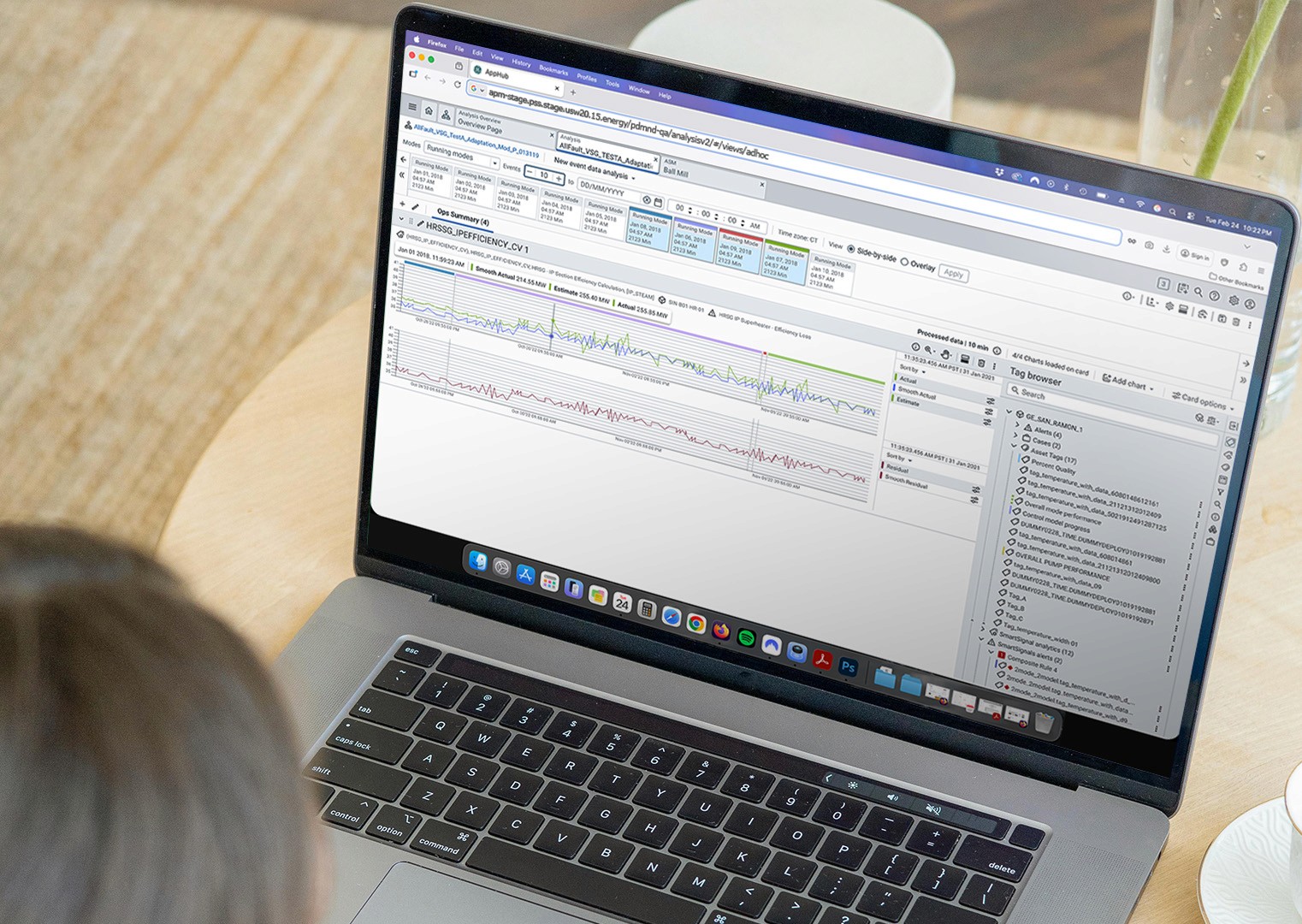
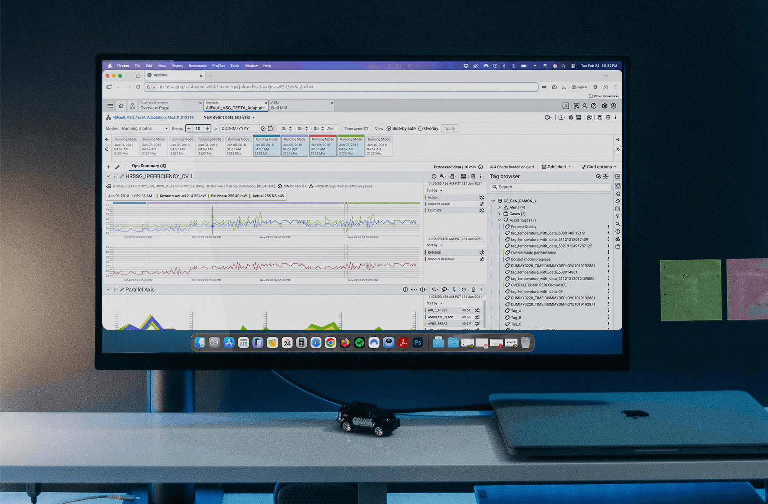
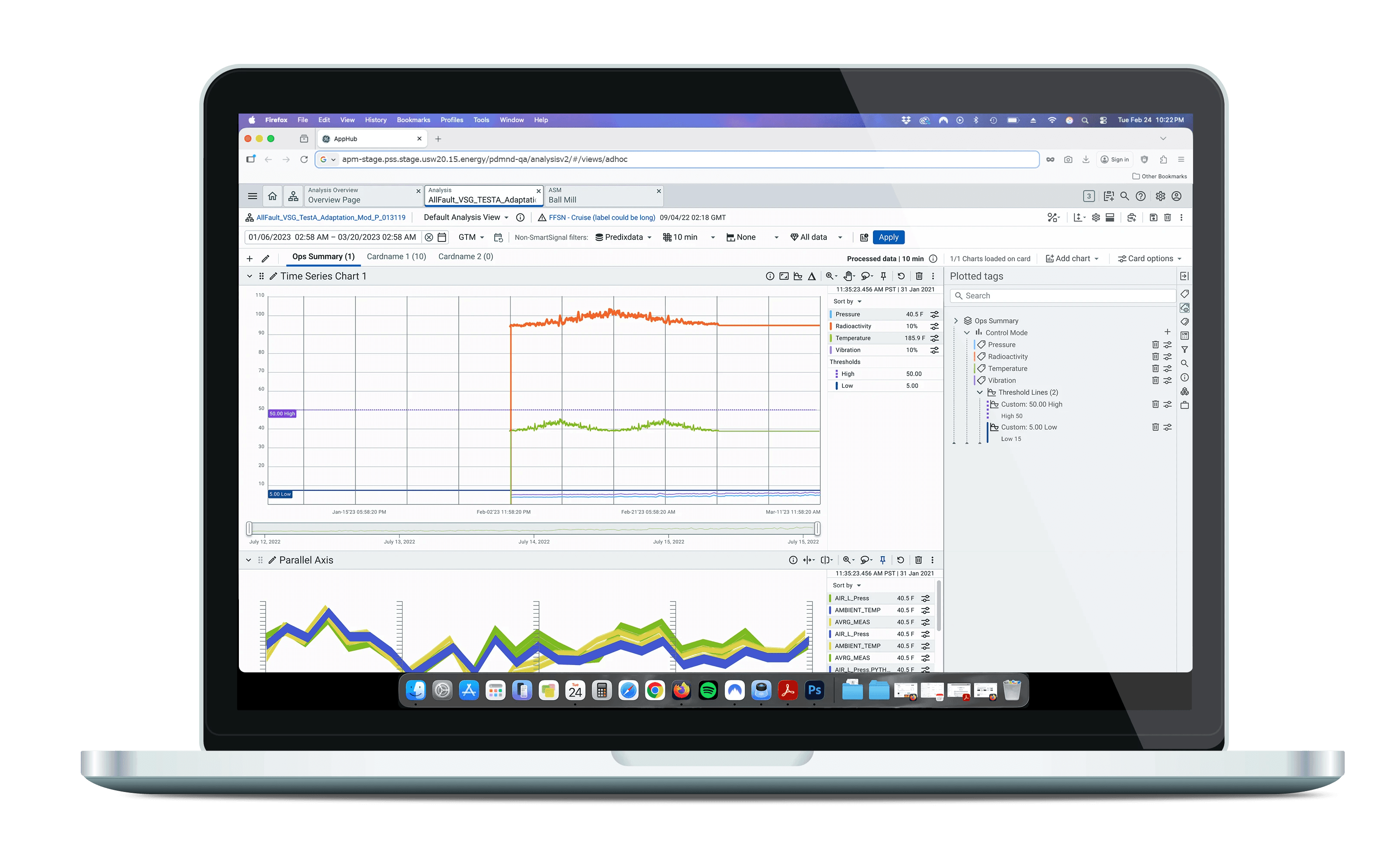
APM Analysis live image

This new redesigned version of Analysis went to GA on July 2025 with a sun-setting target date for the original version in Q2 2026. This project took us close to 3 and half years to go live due to not only technical challenges but the company’s re-organization and layoffs.


Currently, Analysis is still working on some new features and paying off some of the technical and design debt that was incurred. Overall, we have improved the application in almost every aspect our users needed from us. We are still adding new features and updates are been made almost weekly. I don’t have doubt in my mind that Analysis will be one of the best designed and developed applications in the entire APM ecosystem.

This new redesigned version of Analysis went to GA on July 2025 with a sun-setting target date for the original version in Q2 2026. This project took us close to 3 and half years to go live due to not only technical challenges but the company’s re-organization and layoffs.


Currently, Analysis is still working on some new features and paying off some of the technical and design debt that was incurred. Overall, we have improved the application in almost every aspect our users needed from us. We are still adding new features and updates are been made almost weekly. I don’t have doubt in my mind that Analysis will be one of the best designed and developed applications in the entire APM ecosystem.

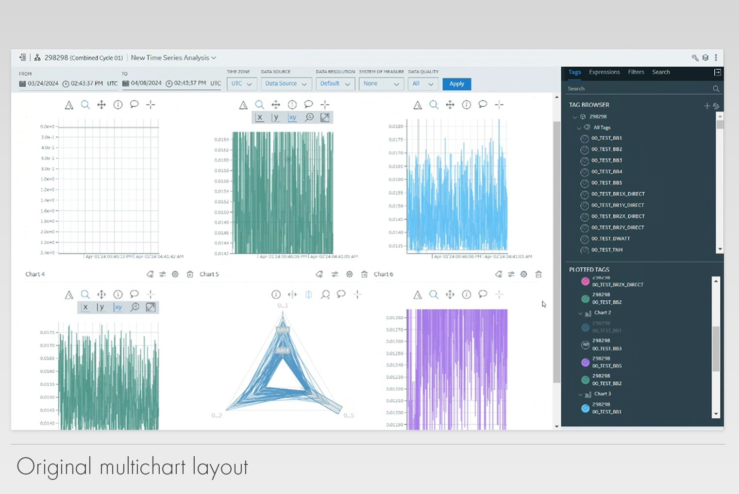
DTOPs original version
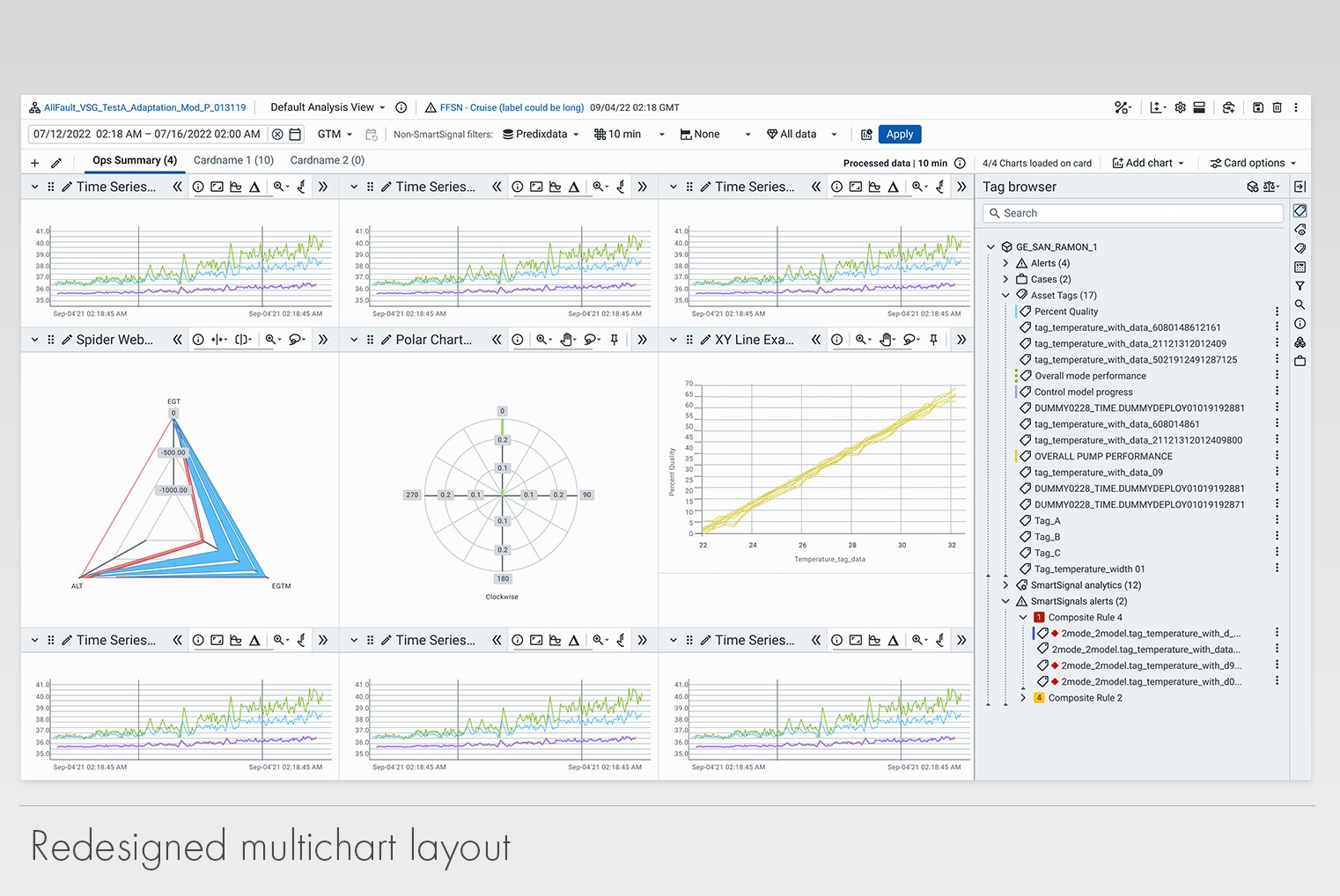
Analysis multi chart layout after the redesign

Find me on the interwebs

Sergio Garcia copyright 2010-2026. | All rights reserved | Sitemap

From Ohio with love

Find me on the interwebs

Sergio Garcia copyright 2012-2024

All rights reserved | Sitemap

From Ohio with love