Agent Dashboard
Agent
Dashboard
Agent Dashboard
Coterie Insurance | UX Lead
Coterie Insurance
UX Lead
Coterie Insurance | UX Lead
Prologue
Prologue
Coterie was an insurance startup which was in the early stages of creating a product that would help independent insurance agents bind policies faster. They wanted to disrupt the binding process and cut the time and effort it took to do so. The goal was to create a platform that would easily satisfy the needs of the agents and create a differentiator in the marketplace. When I joined this project, the company had already created the basic design components, user flows and had a working prototype. However, the idea was there but the execution was lacking. My team was tasked to improve what they already had and hit their target delivery date.
UX Goals
UX Goals
Conduct user research with agents and company SMEs (subject matter experts) to find gaps in the working prototype.
Create a consistent experience across all the workflows leveraging the existing branding guidelines and assets the company had developed.
Ensure the product was responsive and would be able to perform in desktop, tablet and mobile devices.
Make the product WCAG 2.1 Level AA compliant.
Conduct user research with agents and company SMEs (subject matter experts) to find gaps in the working prototype.
Create a consistent experience across all the workflows leveraging the existing branding guidelines and assets the company had developed.
Ensure the product was responsive and would be able to perform in desktop, tablet and mobile devices.
Make the product WCAG 2.1 Level AA compliant.
The Journey
The Journey
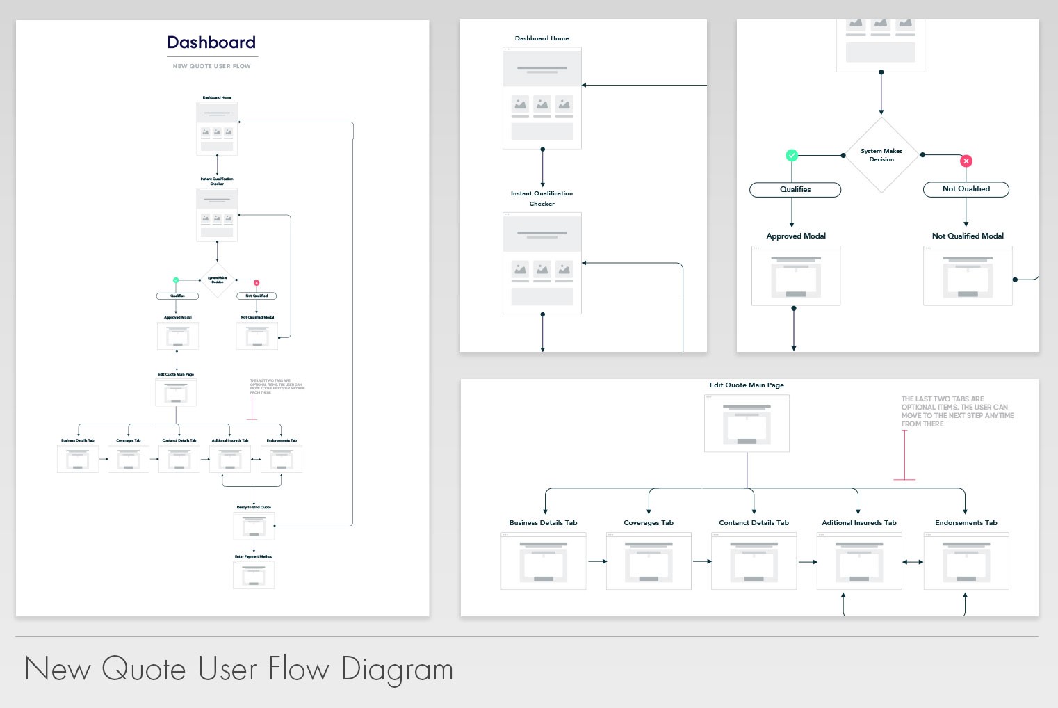
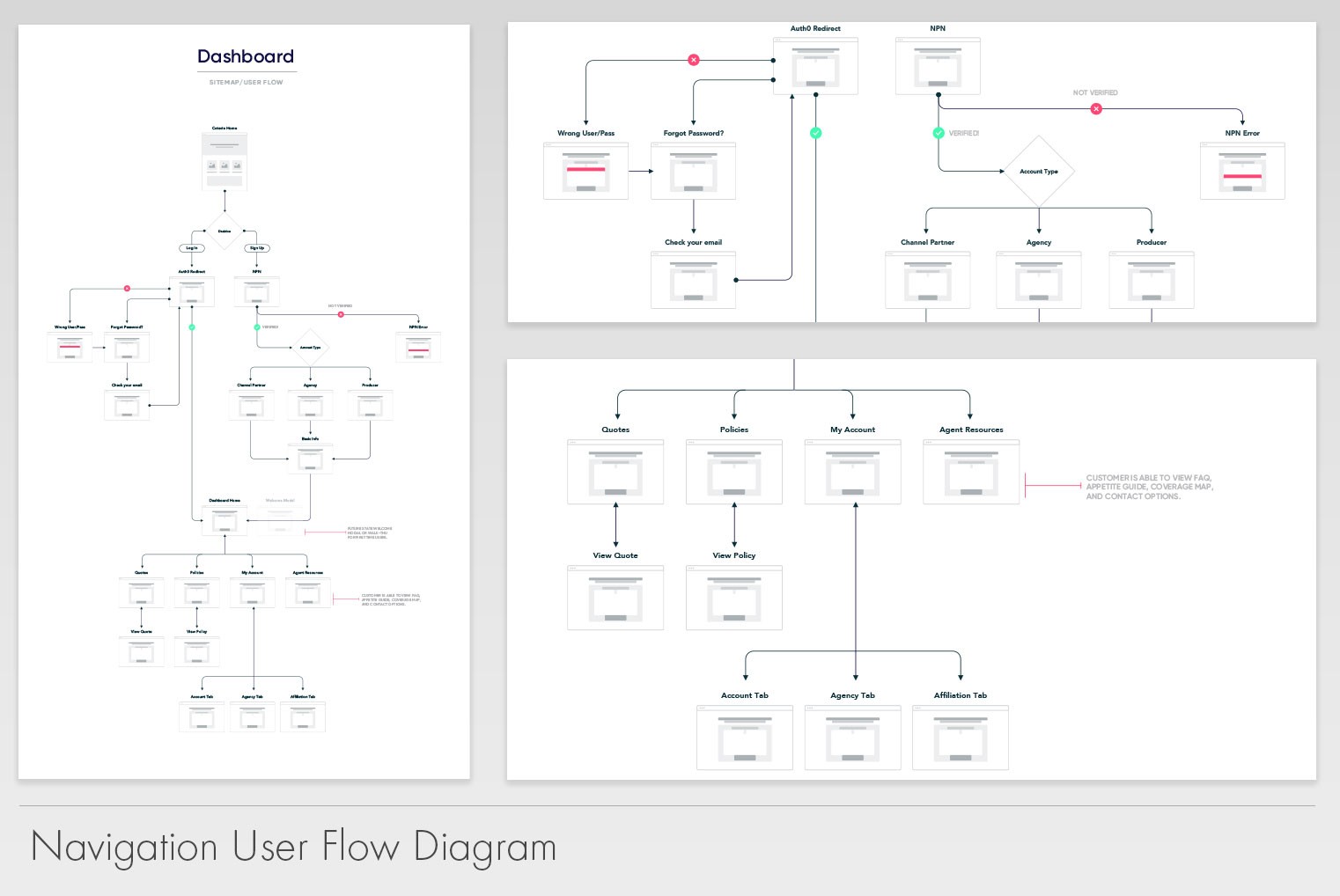
To start this journey, we needed to understand what the users needed from the application in order to want to keep their business with us. We conducted interviews with customers to find their pain points and learn from them what were some essential features they needed. Their feedback is what drove the improvement on the overall experience.
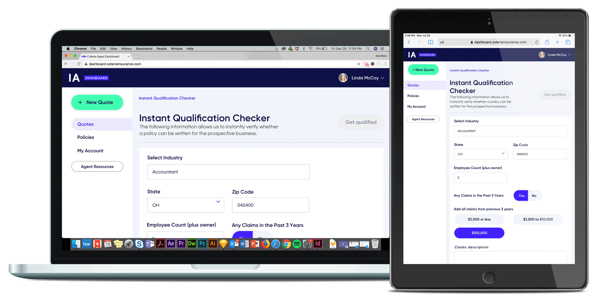
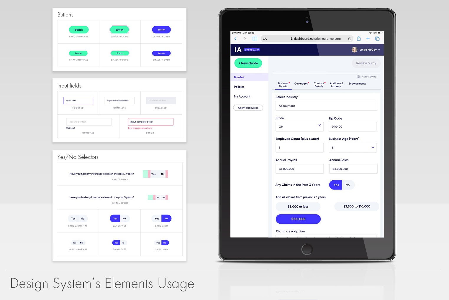
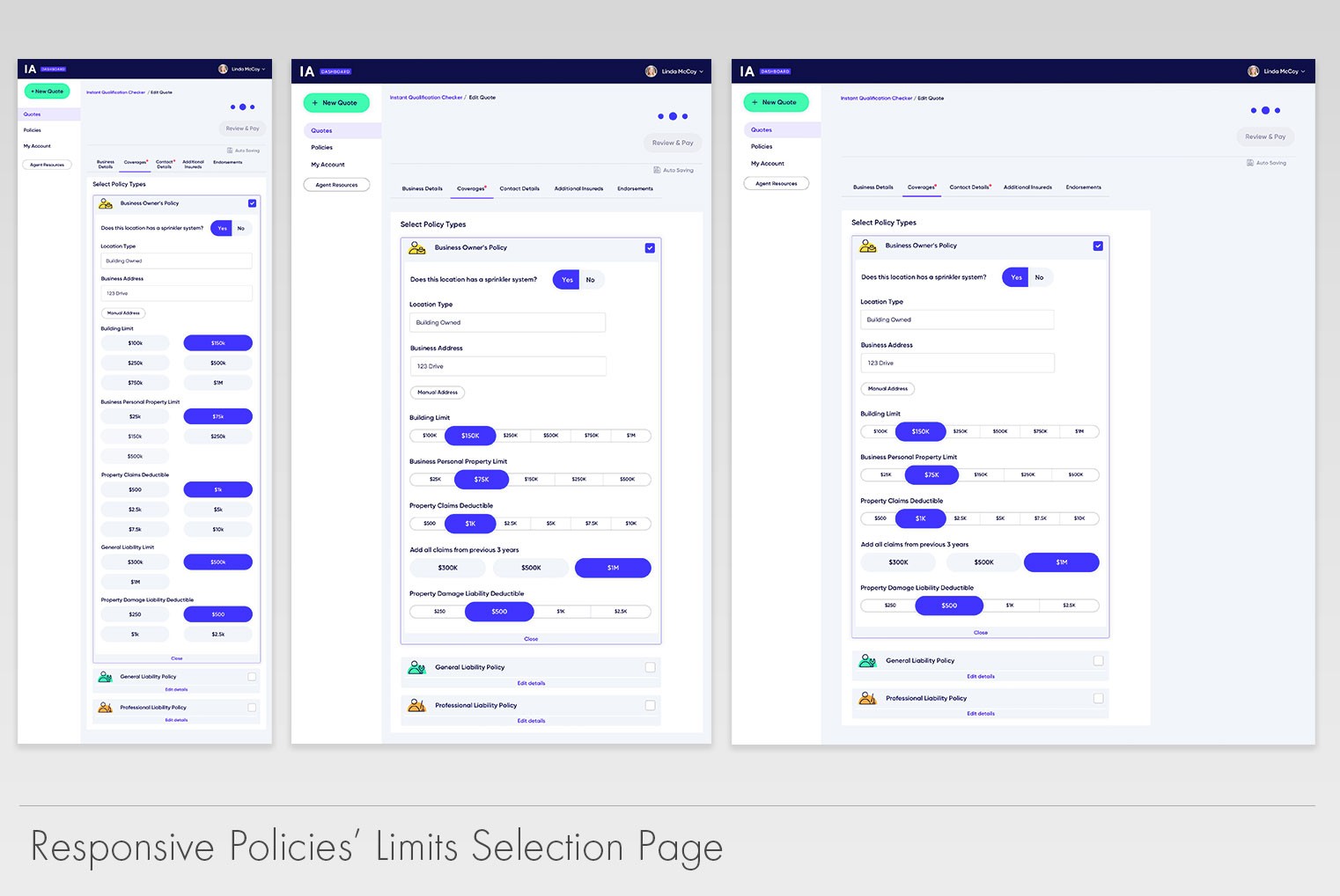
During this period, I discovered that the application was not responsive. It did not scale properly across devices. It used a single media query, which made the mobile experience lackluster. We were forced to address this issue head on. In an era where everything is accessible via phone an insurance agent could not be chained to a desktop to do their job. We needed to be on the run with the agents. Our users needed to be free to use any device anywhere.
With that discovery we pivoted and focused on making the application device responsive over some other features. We did this because the level of effort was high and we needed to have the right scaffolding for future expansion. The tech stack used was not set properly to handle this change hence there was more effort for the development team. Time was of the essence as well. We either spend the time early on or try to retrofit things at a different time (potentially increasing cost and development hours). Upon successfully redesigning the experience, we jumped to design and develop the features our users and company stakeholders had asked us to create. Some of these features were an affiliation system, account management pages and expanded policy pages.
During this period, I discovered that the application was not responsive. It did not scale properly across devices. It used a single media query, which made the mobile experience lackluster. We were forced to address this issue head on. In an era where everything is accessible via phone an insurance agent could not be chained to a desktop to do their job. We needed to be on the run with the agents. Our users needed to be free to use any device anywhere.
With that discovery we pivoted and focused on making the application device responsive over some other features. We did this because the level of effort was high and we needed to have the right scaffolding for future expansion. The tech stack used was not set properly to handle this change hence there was more effort for the development team. Time was of the essence as well. We either spend the time early on or try to retrofit things at a different time (potentially increasing cost and development hours). Upon successfully redesigning the experience, we jumped to design and develop the features our users and company stakeholders had asked us to create. Some of these features were an affiliation system, account management pages and expanded policy pages.
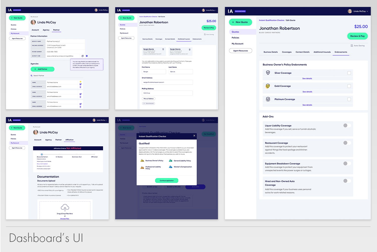
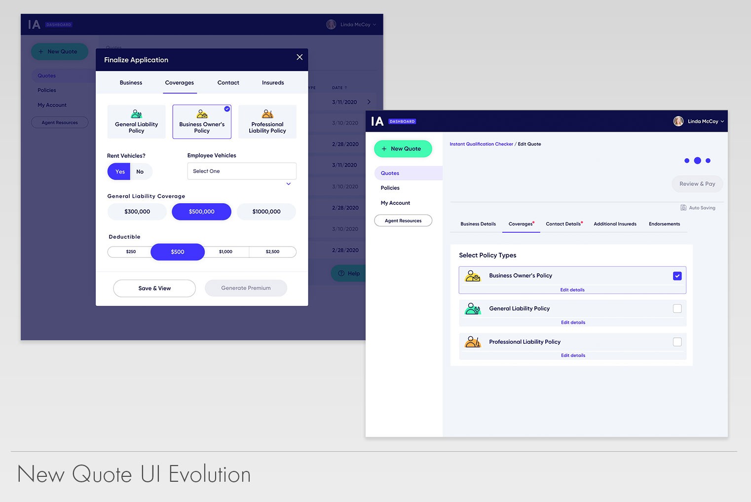
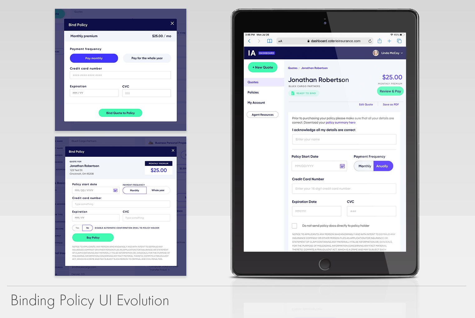
After a successful initial launch. My team and I started working on the second iteration of the dashboard. This version would address issues we uncovered during development but due to the time constraints we were not able to address them earlier. One of the first things I focused on, was to reduce the amount of dialog boxes. The application relied on dialog boxes and scrims heavily, which made the workflows seem cumbersome. We consolidated a lot of the information into pages and tabs to reduce the number of clicks needed from the user.
We introduced a tabbing system which allowed us to group details in a more logical fashion. With the help of our users, we figured how the pages needed to be structured and grouped. In return, these changes not only helped the users but allowed us to track much better user’s flow via our analytics tool. Prior to the change we were missing valuable data because the dialog boxes didn’t show click rates and other pertinent data very well. The change gave us the ability to see exactly where the users were getting stuck and gave us the ability to address the problematic locations accordingly.
After a successful initial launch. My team and I started working on the second iteration of the dashboard. This version would address issues we uncovered during development but due to the time constraints we were not able to address them earlier. One of the first things I focused on, was to reduce the amount of dialog boxes. The application relied on dialog boxes and scrims heavily, which made the workflows seem cumbersome. We consolidated a lot of the information into pages and tabs to reduce the number of clicks needed from the user.
We introduced a tabbing system which allowed us to group details in a more logical fashion. With the help of our users, we figured how the pages needed to be structured and grouped. In return, these changes not only helped the users but allowed us to track much better user’s flow via our analytics tool. Prior to the change we were missing valuable data because the dialog boxes didn’t show click rates and other pertinent data very well. The change gave us the ability to see exactly where the users were getting stuck and gave us the ability to address the problematic locations accordingly.
The Results
The Results
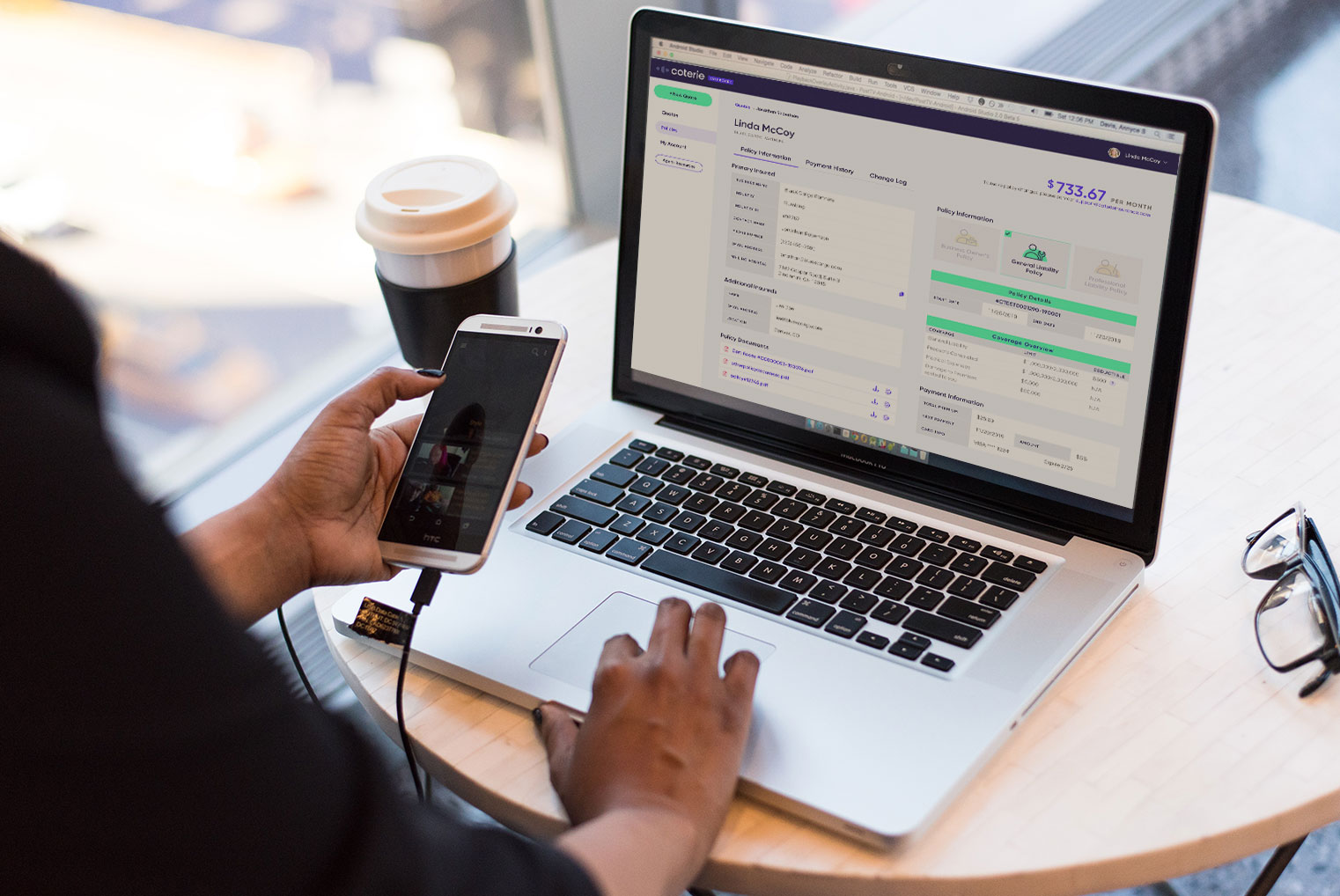
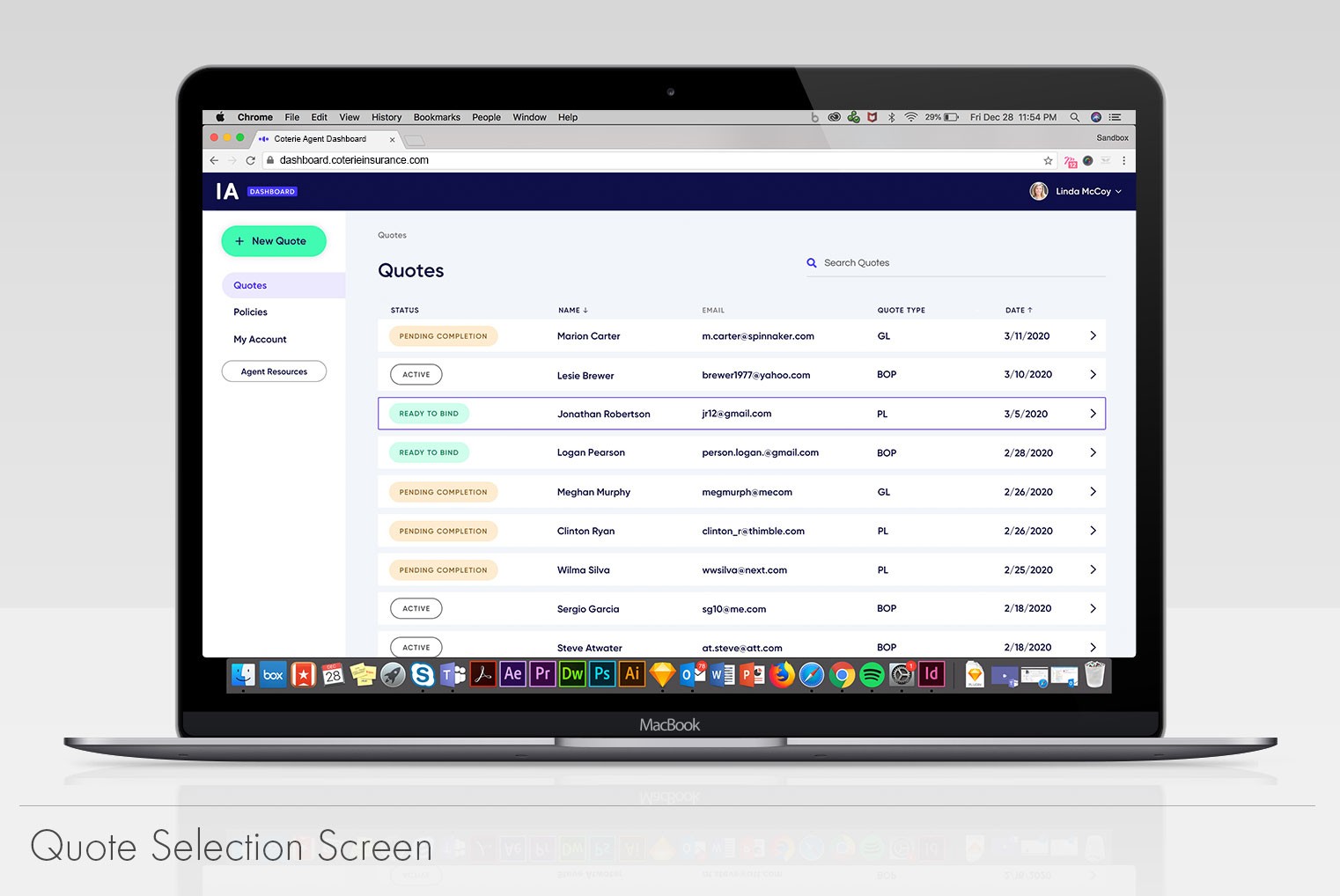
The agent dashboard became the company’s flagship product and provided agents with one of the fastest ways to quote small commercial insurance by cutting the time it took from days to a few hours. Agents could create quotes 24/7 without the need to be in office.
Since its initial launch, the platform added numerous features based directly on user feedback. We received multiple positive comments from agents regarding their satisfaction around ease of use and speed.
The agent dashboard became the company’s flagship product and provided agents with one of the fastest ways to quote small commercial insurance by cutting the time it took from days to a few hours. Agents could create quotes 24/7 without the need to be in office.
Since its initial launch, the platform added numerous features based directly on user feedback. We received multiple positive comments from agents regarding their satisfaction around ease of use and speed.